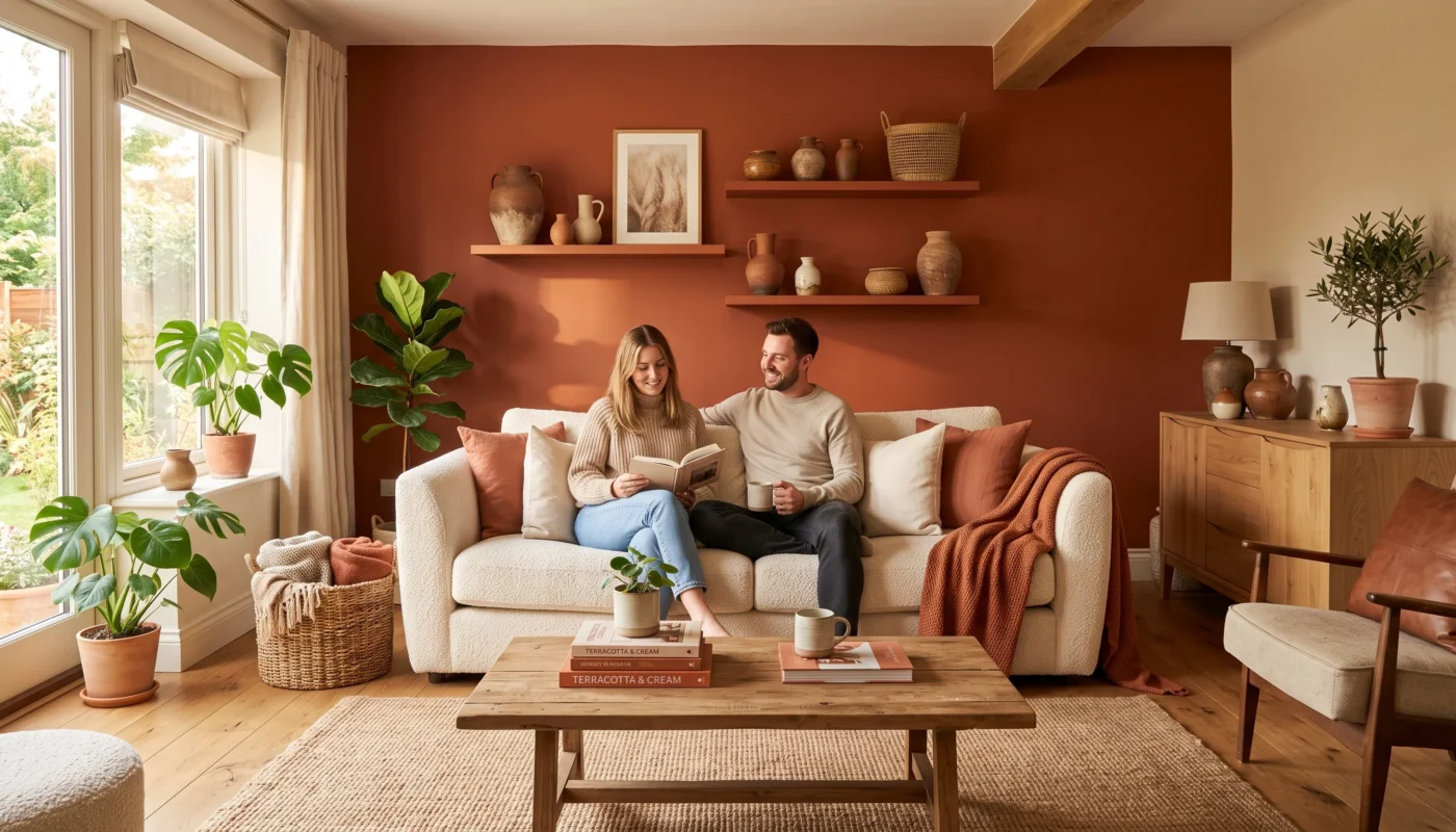

A terracotta and cream color palette brings genuine warmth into a home without tipping into anything overly bold or difficult to live with day to day. As an architect, I think of this particular pairing as one of the most forgiving palettes available, since cream provides a calm, neutral base while terracotta adds just enough earthy depth to keep a room from feeling flat or sterile. This list gathers eighteen ideas for bringing that combination into a home, from a full accent wall down to small, low-commitment accessories. Each one is chosen for genuine versatility, working across a range of home styles rather than one narrow aesthetic.
Start Here: Warm Clay Pottery
This is the lowest-risk way to test this palette in your own home — a single piece of pottery costs little, commits to nothing structural, and immediately shows whether these warm tones genuinely work in your specific lighting and room.
Terracotta Accent Wall
- Painting just one wall in terracotta keeps the color contained and genuinely easy to change later if needed.
- This works especially well on the wall behind a sofa or bed, framing the room’s main furniture piece.
- A matte or lightly textured paint finish deepens the terracotta’s warmth compared to a flat, glossy sheen.
- Keeping the remaining walls in cream or white lets the accent wall read as a genuine focal point.
A terracotta accent wall is one of the most direct ways to bring this palette into a room, committing to the warmer tone on just one surface rather than across the entire space. Painting the wall behind a sofa or a bed frames the room’s main furniture piece naturally, giving that piece a genuine backdrop rather than letting it sit against a plain, undifferentiated wall. As an architect, I think of a single accent wall as a low-risk architectural gesture, since it changes the room’s overall character considerably without requiring any structural change or significant financial investment to accomplish.
A matte or lightly textured paint finish deepens terracotta’s natural warmth considerably compared to a flat, glossy sheen, which tends to read as harder and less inviting under the same lighting conditions. Keeping the remaining walls in a soft cream or off-white lets this single accent wall genuinely function as a focal point, rather than competing with color elsewhere in the room for the same visual attention. This is also one of the easiest ideas on this entire list to reverse later, should your taste or the room’s purpose ever change.
Cream Linen Sofa
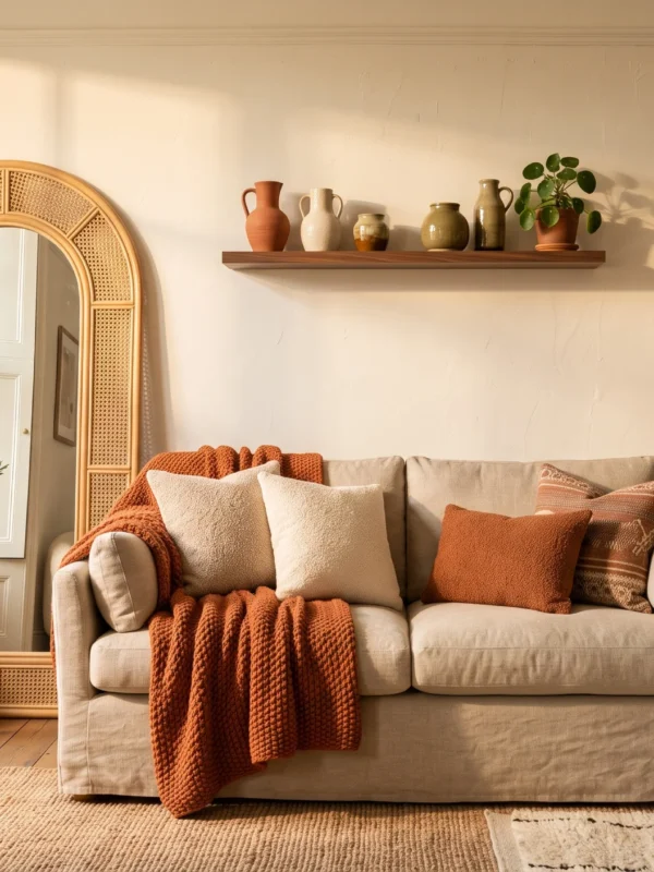
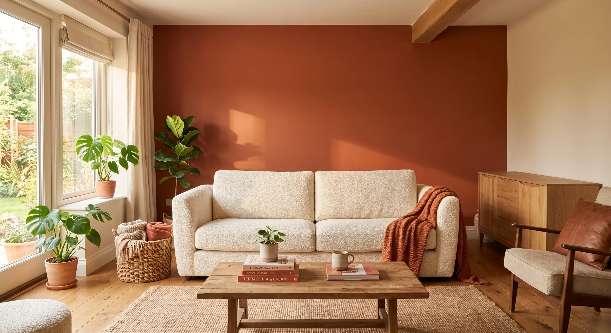
A cream linen sofa gives a room its genuinely calm, neutral foundation, providing exactly the kind of quiet base that terracotta accents need in order to actually stand out and read clearly against it. Linen’s natural texture, with its characteristic slight wrinkle and woven surface, keeps a plain cream sofa from feeling flat or visually boring on its own, adding just enough material interest to hold its place as the room’s largest, most prominent piece of furniture without ever feeling sterile. A sofa in this tone also photographs beautifully in natural light.
This is worth treating as a genuine long-term investment piece, since a cream sofa stays flexible enough to work through several future color and accent changes without ever needing to be replaced alongside them. Layering a terracotta throw pillow or blanket over this neutral base lets you introduce the warmer tone in a way that’s genuinely easy to adjust or remove entirely, depending on the season or your evolving taste in the room’s overall color story as it develops over the years. It also tends to hide everyday wear more gracefully than a stark white fabric would.
- A cream linen sofa provides a genuinely calm, neutral base that terracotta accents can be layered around.
- Linen’s natural texture keeps a plain cream sofa from reading as flat or visually boring on its own.
- This piece works as a long-term investment, since cream stays flexible across many future color changes.
Warm Clay Pottery
- Unglazed terracotta pottery brings the palette’s signature warm tone in through genuine, handmade texture.
- A small grouping of two or three vessels, varied in height, reads as more intentional than one alone.
- This is one of the lowest-commitment ways to test this palette before investing in larger pieces.
- Terracotta pottery pairs naturally with cream ceramics, keeping the overall grouping cohesive rather than mismatched.
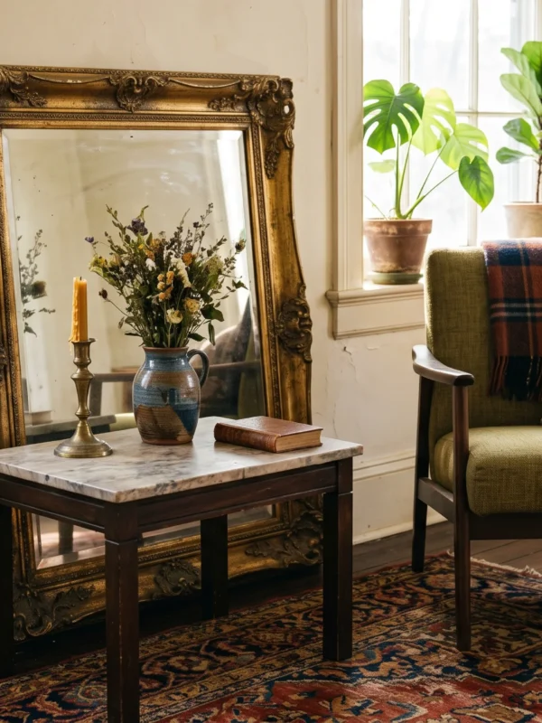
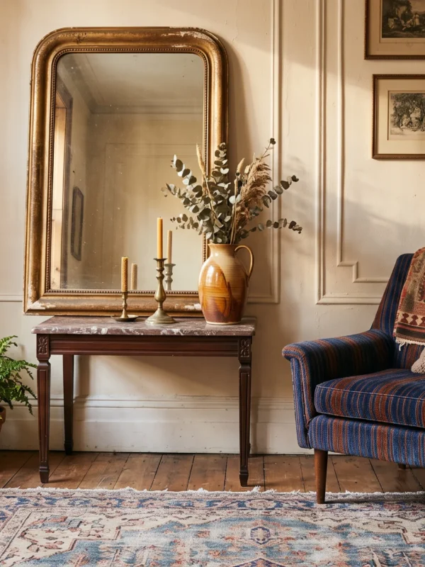
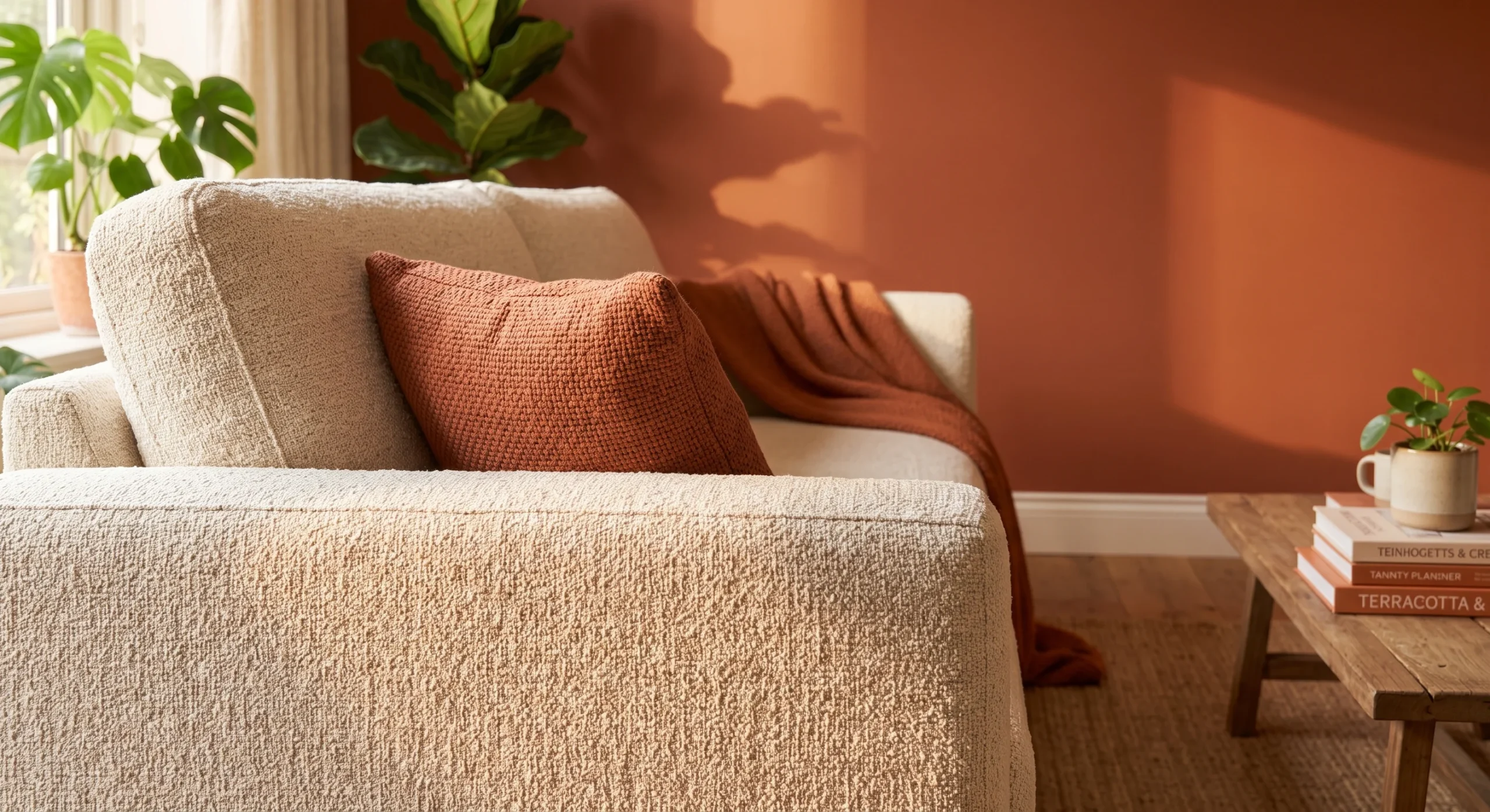
Warm clay pottery brings this palette’s signature terracotta tone into a home through genuine, handmade texture, since unglazed clay carries a warmth and material honesty that a painted or manufactured surface simply cannot replicate. A small grouping of two or three vessels, varied in height and shape rather than perfectly matched, reads as considerably more intentional and collected over time than a single identical set purchased all at once from the same store or catalog. Even a single imperfect vessel, slightly uneven at the rim, tends to read as more genuine than a flawless, factory-produced version of the same shape.
This is genuinely one of the lowest-commitment ways to test whether this palette actually works in your specific home and lighting, since a piece of pottery costs relatively little and requires no permanent change to the room itself. Terracotta pottery pairs naturally alongside cream ceramics or vases, keeping the overall grouping cohesive rather than visually scattered or mismatched. Starting here, before committing to a painted wall or new furniture, is a genuinely sensible way to build confidence in the palette early on. Placing these vessels on a windowsill or open shelf, lets their texture catch light.
Layered Neutral Rugs
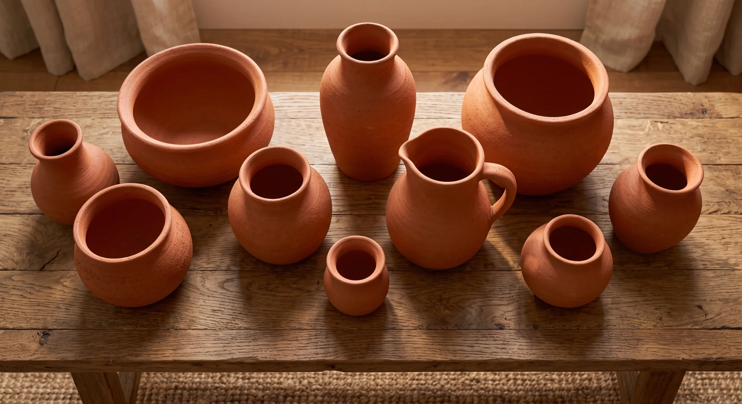
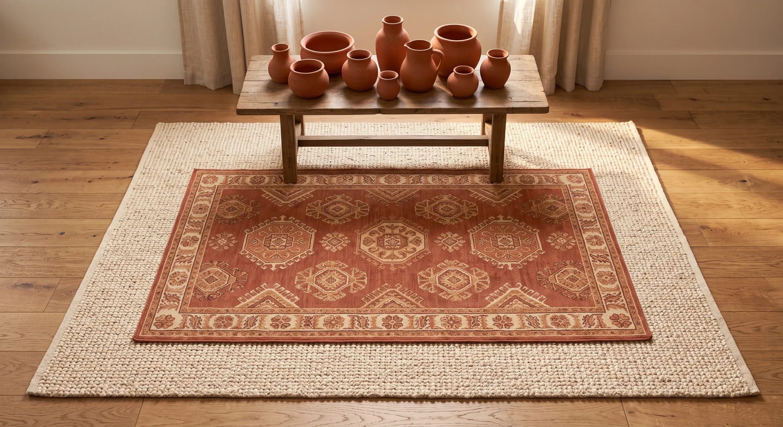
Layering a smaller patterned or terracotta-toned rug over a larger, plain cream or jute base rug brings genuine depth and warmth to a room’s floor without requiring a single piece of furniture or wall color to change. This technique borrows directly from how a room’s flooring plan might layer different materials for both function and visual interest, applying the same principle purely through textiles instead, at a fraction of the cost and effort involved in an actual flooring change or renovation project. It also allows a room to shift seasonally.
This works especially well in a room where the walls and furniture already lean heavily neutral, since the layered rugs introduce color and pattern at ground level without competing with anything happening higher up in the room’s overall composition. Choosing a smaller rug with terracotta tones, rather than a large single rug in that same color, keeps the warmth feeling intentional and contained rather than overwhelming the entire floor. This is a genuinely easy, fully reversible way to test the palette underfoot first before going further.
Terracotta Kitchen Tile
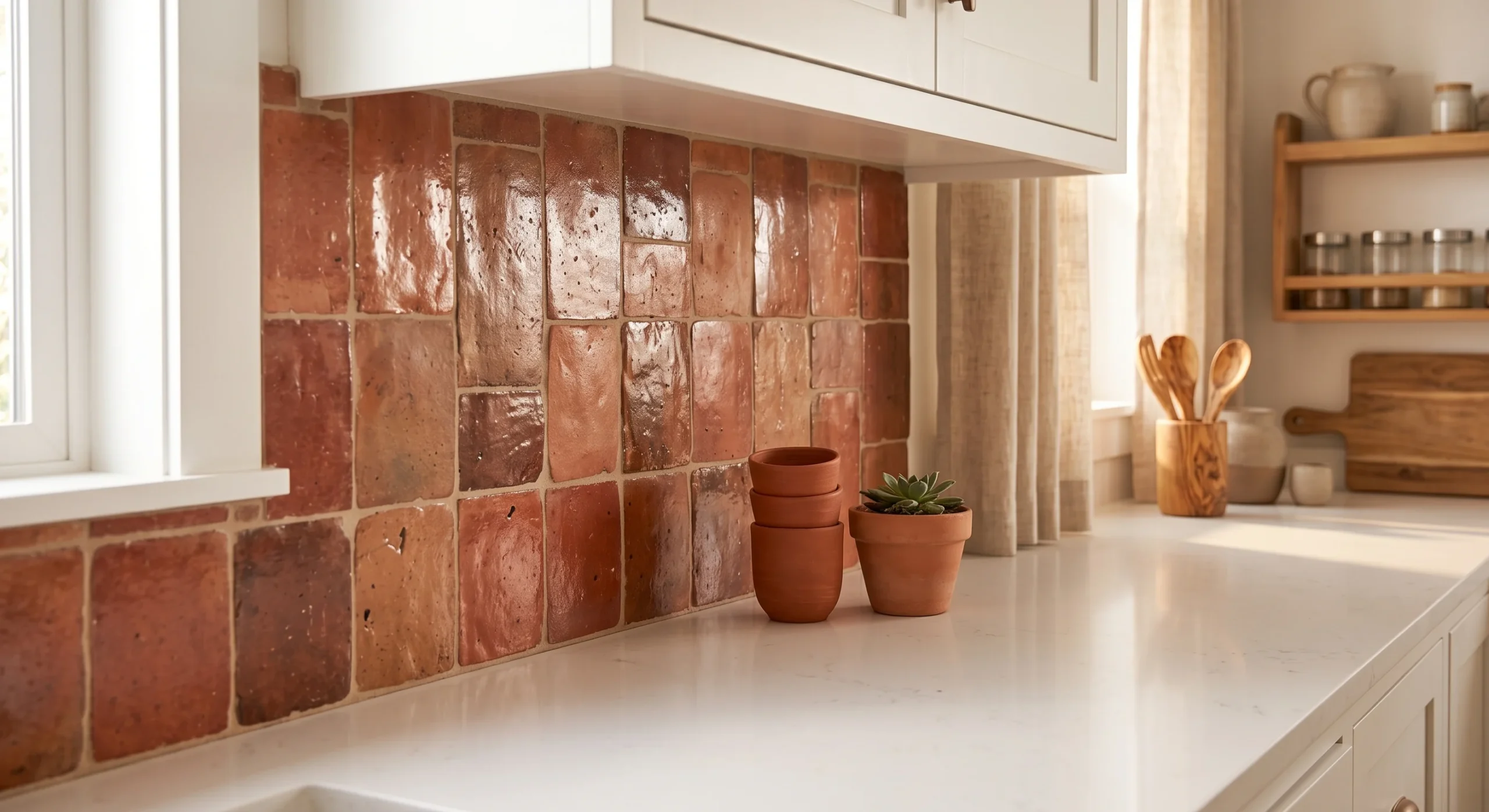
A terracotta tile backsplash introduces genuine warmth into a kitchen through one of its most visually prominent, frequently viewed surfaces, without requiring a full cabinet replacement or countertop change to accomplish the same overall effect. Handmade or slightly irregular tiles, with natural variation in tone from one piece to the next, add real visual texture and character that a perfectly uniform, mass-produced tile simply cannot replicate across the same wall space or backsplash run. Choosing a tile with a slightly matte, rather than glossy, glaze also softens the overall look, keeping the kitchen feeling warm rather than clinical.
This pairs especially well with white or cream cabinetry, which keeps the overall kitchen feeling bright and airy rather than visually heavy, letting the terracotta read as a genuine accent rather than an overwhelming dominant tone throughout the space. This is a renovation-level commitment compared to some of the smaller ideas on this list, but it delivers a genuinely lasting, architecturally integrated result that a removable accessory simply can’t match in the same way over time. Sampling a few tiles against your actual cabinetry before committing to a full order is genuinely worth the extra time this step takes.
- A terracotta tile backsplash introduces warmth into a kitchen without requiring a full cabinet or counter change.
- Handmade or slightly irregular tiles add genuine visual texture that a perfectly uniform tile can’t offer.
- This pairs especially well with white or cream cabinetry, keeping the kitchen feeling bright rather than heavy.
Cream Painted Trim
- Painting trim in a soft cream, rather than stark white, adds subtle warmth throughout an entire room.
- This works well alongside terracotta accents, keeping the whole palette feeling cohesive rather than cold.
- Cream trim reads as considerably softer under both natural and artificial lighting than a bright white.
- This is a low-cost update, since trim requires far less paint than an entire wall or room.
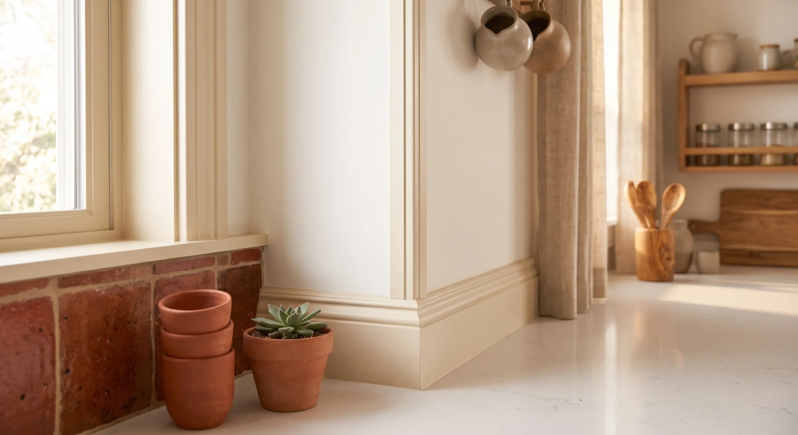
Painting window trim, baseboards, and door frames in a soft cream, rather than the stark white so many homes default to, adds subtle warmth throughout an entire room without requiring any bold color commitment on the walls themselves. This small shift changes how the whole room reads under both natural daylight and artificial evening light, since a warmer trim color removes the slightly cold, clinical edge that bright white trim can introduce, even in a room that’s otherwise already warm-toned and inviting. It’s a detail most guests won’t consciously notice.
This works especially well alongside terracotta accents elsewhere in the room, keeping the entire palette feeling cohesive and considered rather than having warm accents fight against a colder architectural backdrop. This is also one of the more genuinely low-cost updates on this entire list, since trim requires considerably less paint and effort than an entire wall or room repaint, making it an easy weekend project with a real, noticeable effect on the whole space. Testing a small swatch on the actual trim before committing to the full room helps confirm the tone reads correctly under your specific lighting.
Rust Velvet Cushions
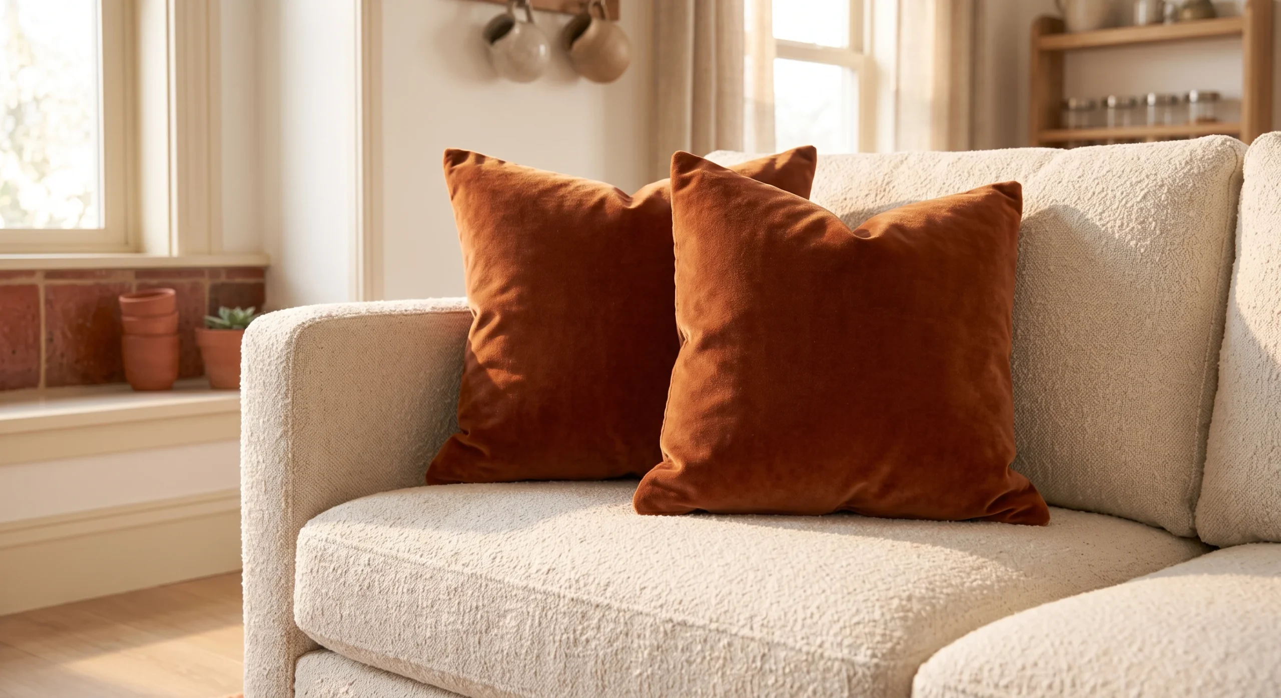
Rust velvet cushions bring a deeper, richer version of terracotta into a room without requiring commitment to a full wall color or an entirely new sofa, working instead as a small, easily changed accent layered on top of an existing neutral base. Velvet’s soft sheen catches and reflects light differently than a matte linen or cotton fabric, adding genuine tonal variation and a bit of visual richness to what might otherwise be a fairly flat, uniformly textured seating area or corner. Choosing two cushions rather than one also creates a sense of visual balance on a sofa, instead of a single accent looking oddly isolated.
This is genuinely one of the easiest, most affordable ways to test a deeper rust tone in your own specific space before committing to anything larger or more permanent elsewhere in the room. A pair of cushions costs relatively little and can be swapped out entirely if your taste shifts, which makes this a genuinely low-risk entry point for anyone still deciding how much of this warmer palette they actually want to commit to long-term throughout their home. Rotating these cushions with a plainer cream pair during warmer months is an easy way to shift the room’s mood without buying anything new.
- Rust velvet cushions add a deeper, richer version of terracotta without committing to a full wall or sofa.
- Velvet’s soft sheen catches light differently than linen, adding genuine tonal variation to the room.
- This is one of the easiest, most affordable ways to test a deeper rust tone in your space.
Woven Cream Baskets
- Woven cream baskets add genuine texture and practical storage in one single, versatile piece.
- This works well for blankets, magazines, or toys, keeping everyday clutter visually organized.
- Natural fiber weaves pair especially well with terracotta’s own earthy, handmade material quality.
- Stacking two or three different sizes together reads as more intentional than one basket alone.
- This is a genuinely practical idea, solving a real storage need alongside its visual contribution.
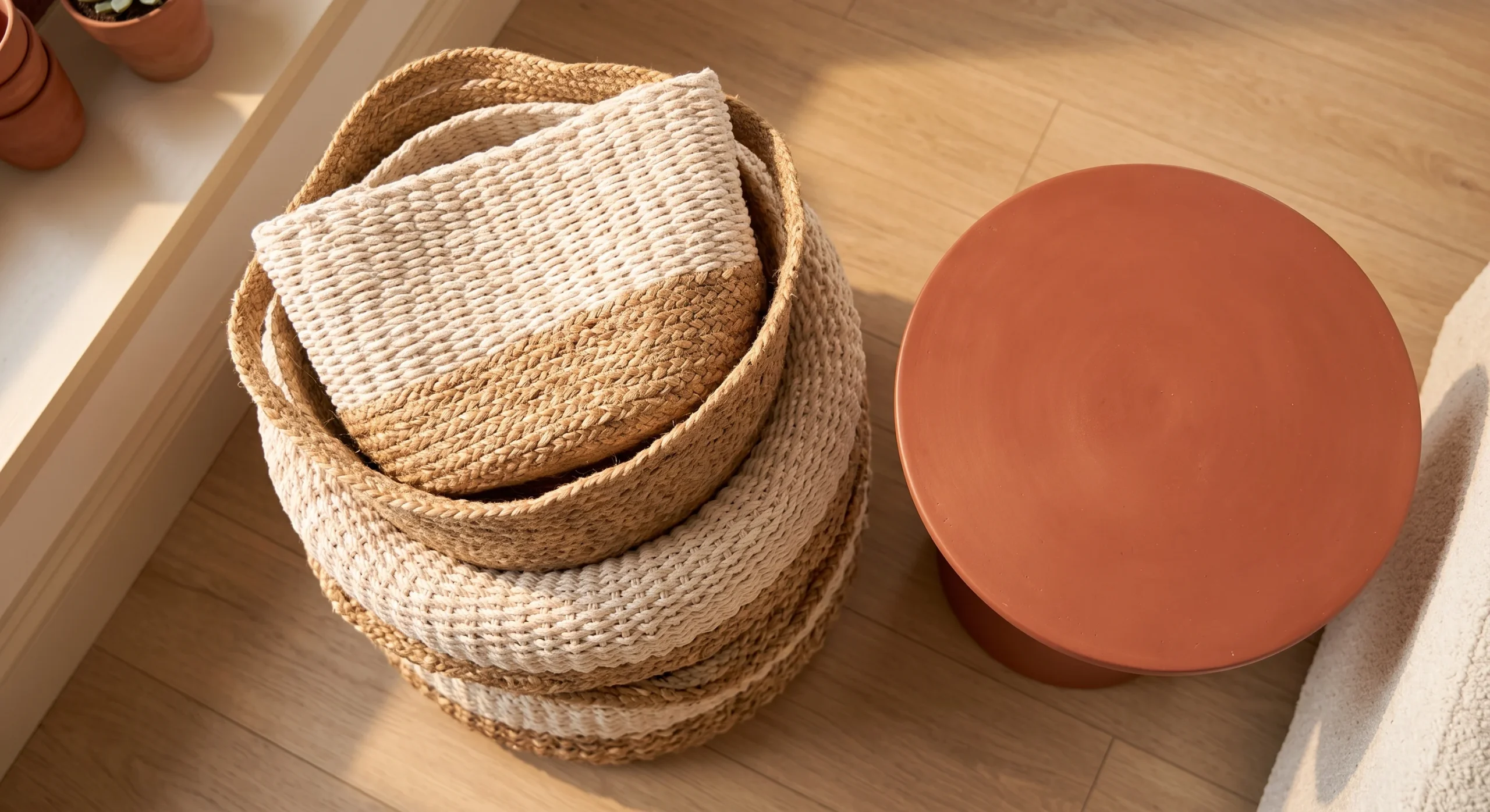
Woven cream baskets bring genuine texture into a room while also solving a real, practical storage need, combining function and material interest into a single versatile piece rather than requiring two separate solutions for the same problem. This works especially well for blankets, magazines, or children’s toys, keeping everyday household clutter visually organized and tucked away rather than scattered loosely across the floor or a nearby chair throughout the busy day. Choosing a basket with a handle also makes it considerably easier to actually use for its intended storage purpose day to day.
Natural fiber weaves, like seagrass or rattan, pair especially well with terracotta’s own earthy, handmade material quality, reinforcing the same organic, textural story this entire palette is built around achieving. Stacking two or three different basket sizes together, rather than using just one, reads as considerably more intentional and genuinely collected over time, echoing the same grouping principle that works well for the pottery covered earlier on this list, tying the room together. A basket placed at the base of a shelf or beside a sofa also fills an otherwise awkward empty corner of the room.
Terracotta Planters
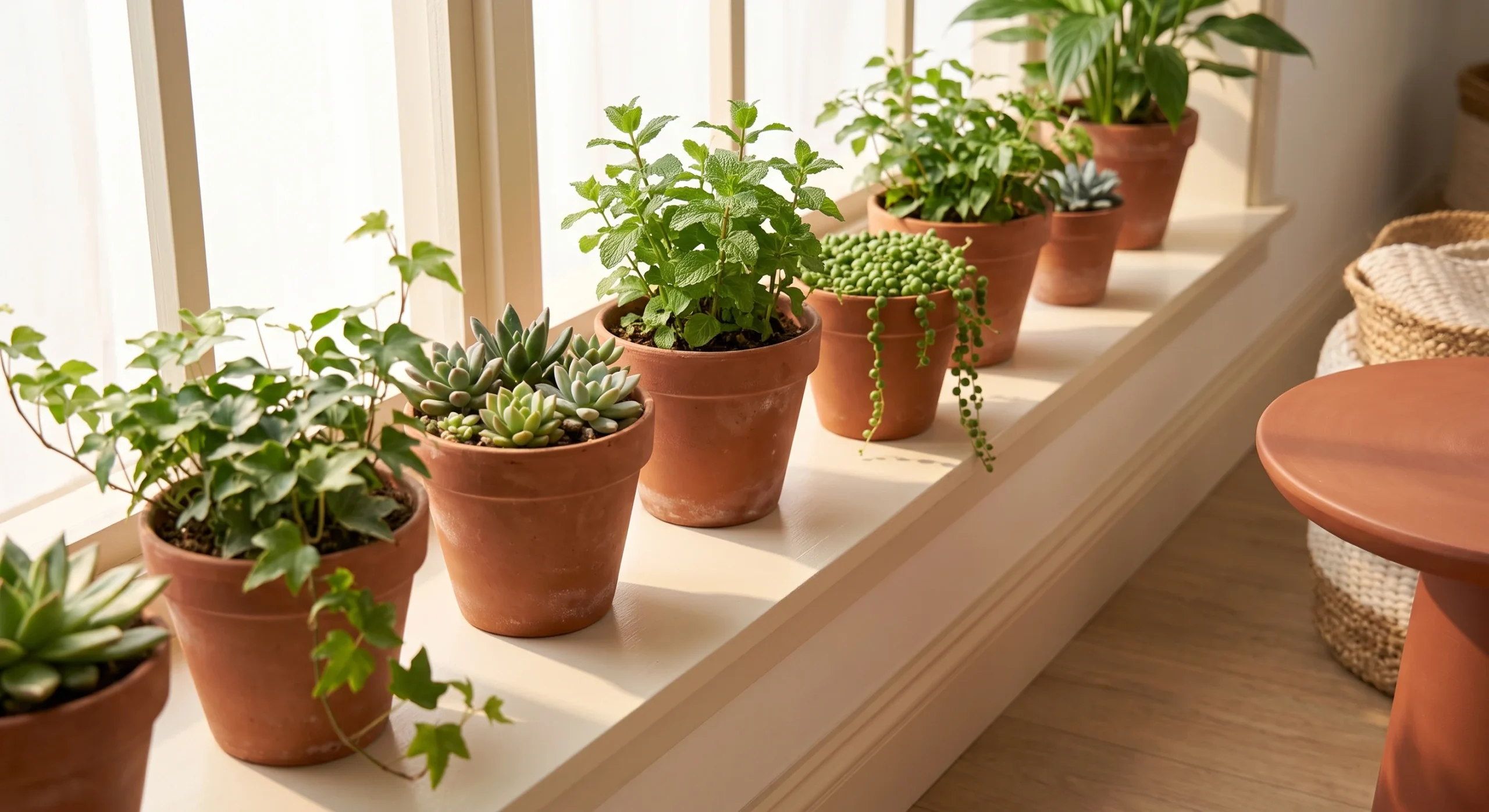
Terracotta planters bring this palette’s core material directly into a room through the classic, traditional unglazed clay pot, a material choice that predates most current design trends and remains genuinely timeless as a result. Pairing these pots with actual living plants softens the overall palette considerably, adding genuine green alongside the warm terracotta and cream tones, which keeps the room from feeling too monochromatically warm or heavy without any contrasting color present anywhere. Even a small collection of three or four differently sized pots, grouped together on one surface, creates a noticeably fuller, more considered display.
This idea works in nearly any room of the home, from a kitchen windowsill to a living room corner to a bathroom shelf, making it one of the most flexible and widely applicable ideas on this entire list. Terracotta pots are also genuinely inexpensive and widely available, which makes this an easy, low-risk way to start introducing the palette’s signature material and color into a home before committing to anything larger or more permanent elsewhere in the space later. Choosing plants with genuinely low maintenance needs, like a snake plant or pothos, keeps this idea realistic for a genuinely busy household.
- Classic unglazed terracotta pots bring this palette’s core material into a room through actual, living plants.
- This pairs genuine greenery with warm tones, softening the palette rather than letting it feel too heavy.
- Terracotta pots work in nearly any room, making this one of the most flexible ideas on this list.
Cream Boucle Chair
- A bouclé chair in cream adds genuine tactile texture without introducing any additional color to the room.
- This works as a secondary seating piece, adding warmth through material rather than paint or accessories.
- Bouclé’s nubby texture photographs and reads especially well against a terracotta accent wall nearby.
- This is a genuine investment piece, worth prioritizing over several smaller decorative purchases instead.
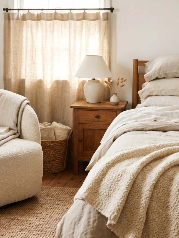
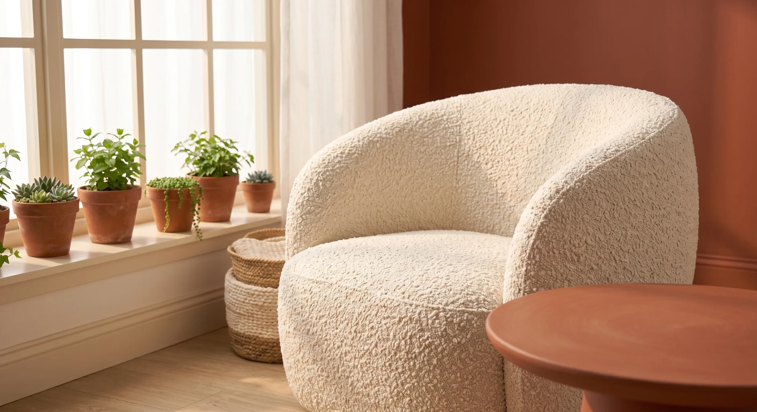
A cream bouclé chair adds genuine tactile texture into a room without introducing any additional color, letting the material itself carry visual interest rather than relying on a bold accent tone to do that same work elsewhere in the space. This works especially well as a secondary seating piece alongside a primary sofa, adding warmth and softness through material choice rather than through paint, pattern, or an abundance of smaller decorative accessories scattered around the room’s corners. Positioning this chair near a window also lets its texture catch changing daylight throughout the day, adding subtle movement to an otherwise still corner.
Bouclé’s distinctive nubby, looped texture photographs and reads especially well positioned against a terracotta accent wall nearby, since the contrast between the two materials, one smooth and matte, one textured and dimensional, creates genuine visual interest without needing any additional color introduced. This is worth treating as a genuine investment piece, prioritized over several smaller decorative purchases that would add considerably less lasting impact to the room’s overall feel and material story over time. A chair like this also tends to anchor an otherwise underused corner of a room, giving it a genuine sense of purpose and warmth.
Warm Wood Flooring
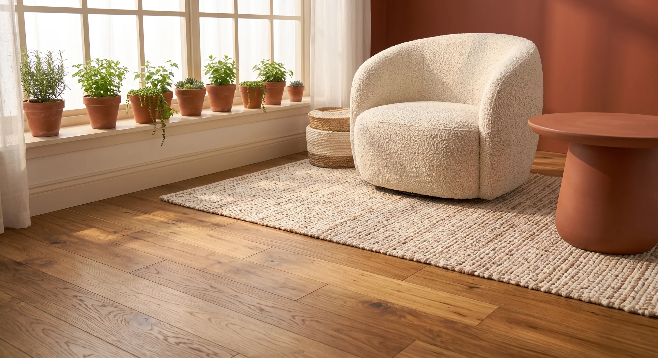
Warm wood flooring provides the literal foundation this entire palette builds on top of, since a honey or amber-toned wood floor already carries much of the same warmth that terracotta and cream are working to bring into the rest of the room. This matters structurally as much as visually: a cool-toned gray floor would genuinely fight against this palette’s overall warmth, while a warm wood floor reinforces it from the ground up, tying the whole room’s material story together from the very first surface a person’s eye lands on when entering.
If replacing flooring isn’t realistic, a warm-toned area rug can approximate a similar effect, layering a similar tone over an existing cooler floor without requiring an actual renovation. As an architect, I think of flooring as one of the most foundational material decisions in any room, since every other color and texture choice gets read in relation to it. Getting this one element right early, whenever possible, makes every subsequent decision in the room noticeably easier to make well and last. A rug in a similar honey or amber tone can echo this warmth convincingly enough that most people won’t notice the difference underfoot.
Terracotta Ceramic Lamps
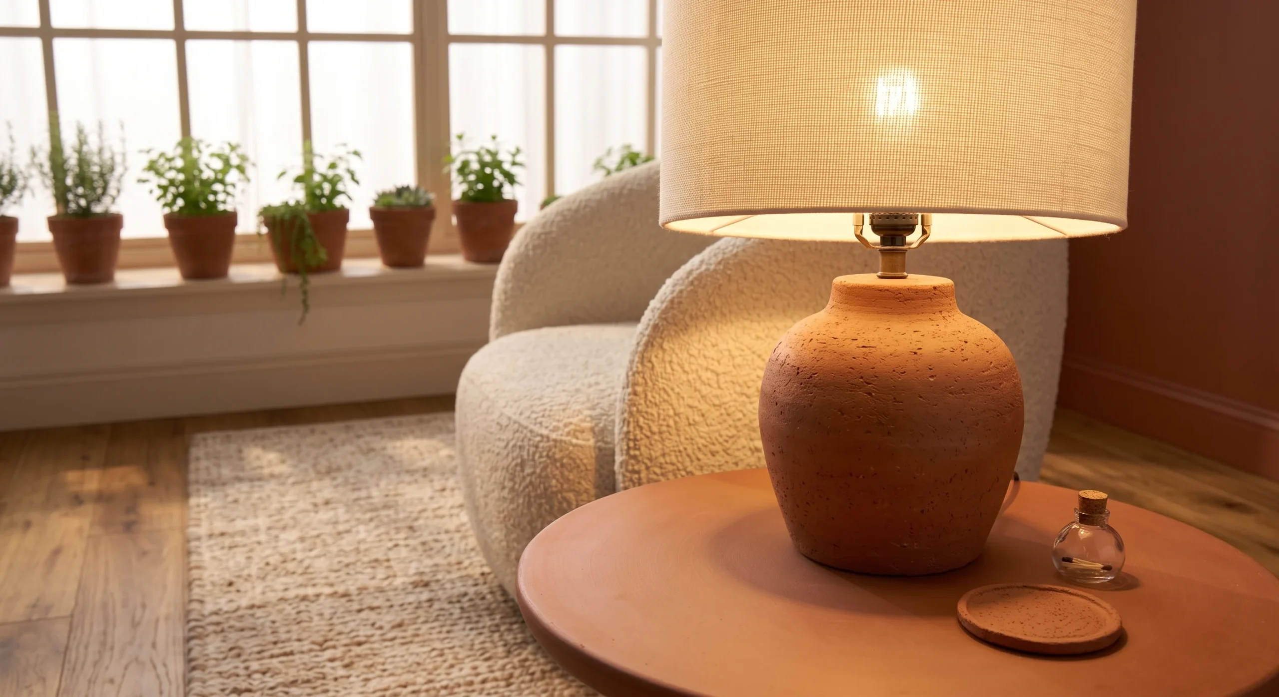
A terracotta ceramic lamp base, paired with a soft cream linen shade, combines both halves of this palette into a single functional object, doing genuine double duty as both real task lighting and a decorative anchor for a side table or console. The warm glow this pairing casts in the evening reinforces the palette’s overall warmth even further, since the lamp’s own light takes on a similarly warm cast that complements rather than competes with the terracotta base beneath it directly. Placing this lamp somewhere it’s actually used in the evening, rather than purely as a daytime accessory, lets its full warmth genuinely come through.
This is a genuinely easy way to introduce the palette into a room that doesn’t already have terracotta represented elsewhere, since a lamp is a piece nearly every room needs regardless of its existing color story. Choosing a lamp base with visible handmade texture, rather than a perfectly smooth, mass-produced finish, adds a bit of authentic material character that reinforces the same organic, earthy quality the rest of this palette is generally working to achieve throughout an entire home. Pairing it with a dimmer switch also lets the warm glow adjust throughout the evening, from bright and functional to soft and relaxed.
Cream Curtain Panels
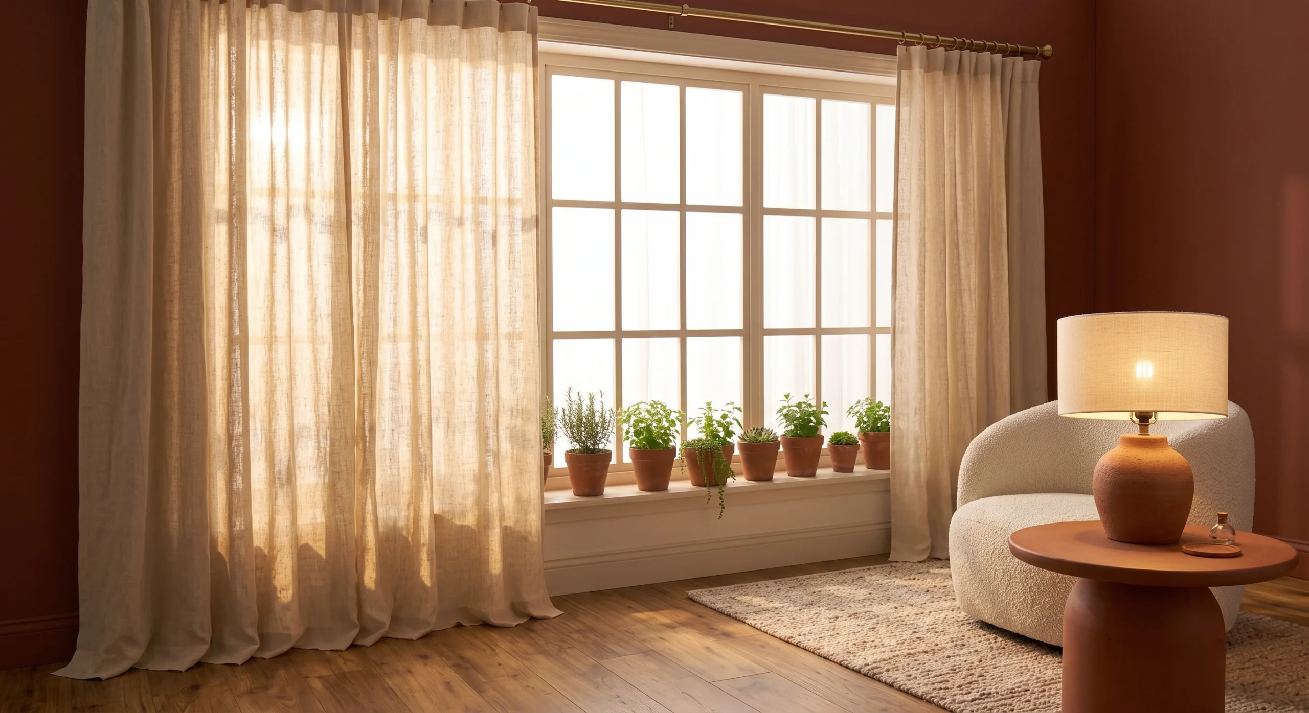
Cream curtain panels soften incoming natural light into something noticeably warmer and more flattering than a stark white sheer fabric would provide, filtering daylight in a way that reinforces this palette’s overall warm character even during the parts of the day when the sun itself is genuinely bright and cool-toned outside. This is a subtle but genuinely effective way to extend the palette into a room’s window treatments, an area that’s easy to overlook when focusing mainly on walls, furniture, and accessories elsewhere. Choosing a lightly textured linen weave adds depth as light passes through.
This provides a genuinely neutral, warm-toned backdrop that terracotta furniture, pottery, or accessories can stand out against clearly, rather than competing with a stark white or a patterned curtain elsewhere in the same window. Hanging floor-length panels close to the ceiling, rather than just above the window frame, adds real height to the room alongside the palette’s overall warmth, echoing the same architectural trick used for linen drapery in more purely minimalist rooms as well and elsewhere. This small architectural adjustment costs nothing beyond the curtain hardware itself, yet it noticeably changes how proportioned the entire window wall feels.
- Cream curtain panels soften natural light into something warmer than a stark white sheer fabric would.
- This provides a genuinely neutral backdrop that terracotta furniture and accessories can stand out against clearly.
- Floor-length panels, hung close to the ceiling, add height alongside the palette’s overall warmth.
Burnt Orange Throw
- A burnt orange throw adds a bolder, more saturated version of terracotta as a single accent piece.
- This works well draped casually over a sofa arm or the foot of a bed for texture.
- Choosing a knit or chunky-weave throw adds tactile warmth alongside the color itself.
- This is easy to swap out seasonally, keeping the palette feeling fresh rather than static.
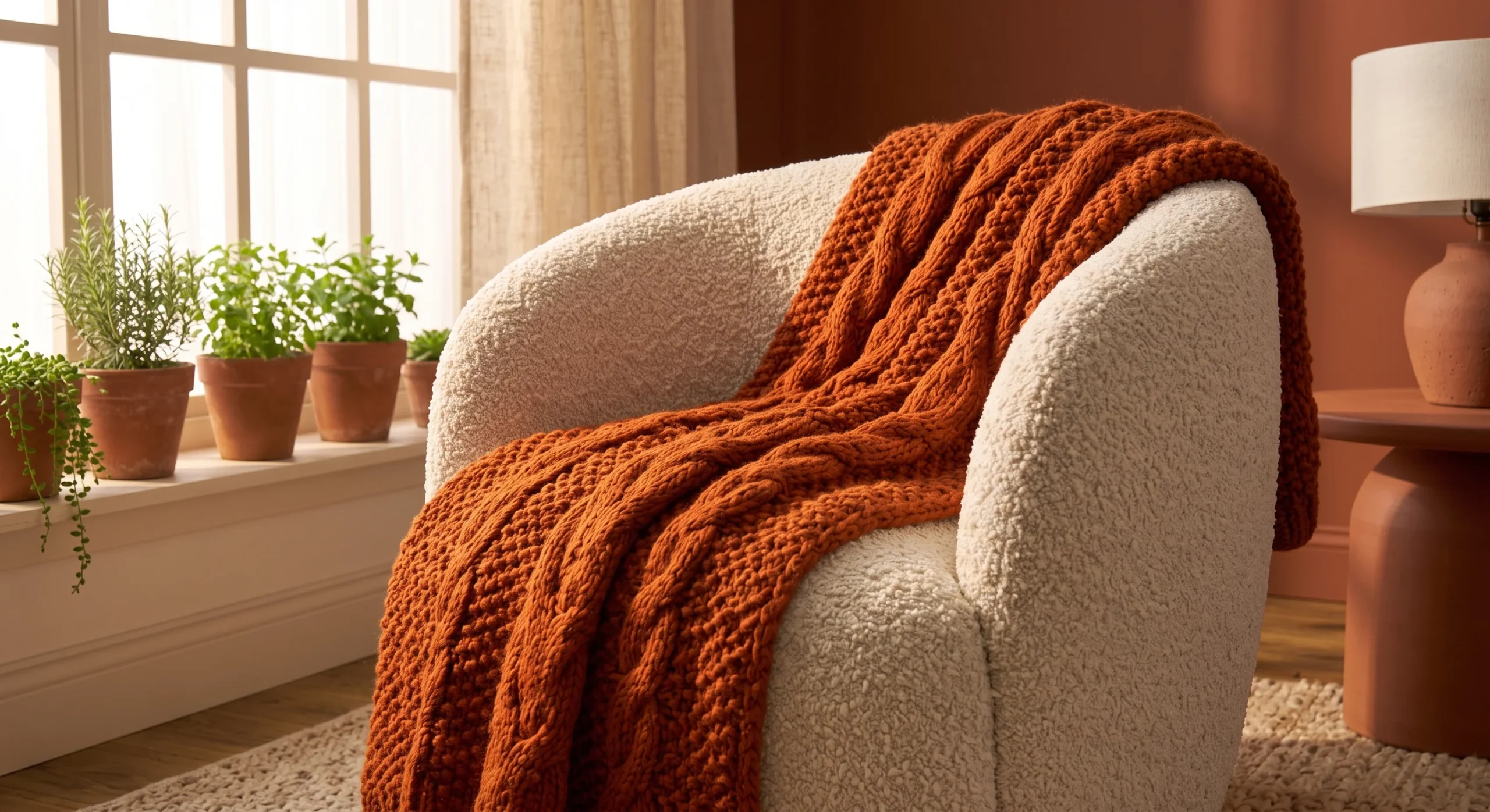
A burnt orange throw introduces a bolder, more saturated version of terracotta into a room as a single, easily adjustable accent piece, rather than committing to that deeper tone across a larger, more permanent surface like a wall or a sofa. This works especially well draped casually over a sofa arm or across the foot of a bed, adding a genuine pop of color and texture without requiring any structural change to the room’s existing furniture or paint scheme at all. Folding it loosely rather than perfectly also keeps the look feeling lived-in and natural, rather than overly staged for a single photograph.
Choosing a knit or chunky-weave throw, rather than a smooth, flat fabric, adds real tactile warmth alongside the color itself, reinforcing the same textural richness this palette generally depends on throughout every other idea on this list. This piece is also genuinely easy to swap out seasonally, rotating in a lighter cream throw during warmer months and bringing the burnt orange back out once the weather cools, keeping the room’s palette feeling fresh rather than static year-round and predictable. A throw like this also works well draped over a reading chair, giving that spot in the room its own small moment of warmth.
Textured Plaster Walls
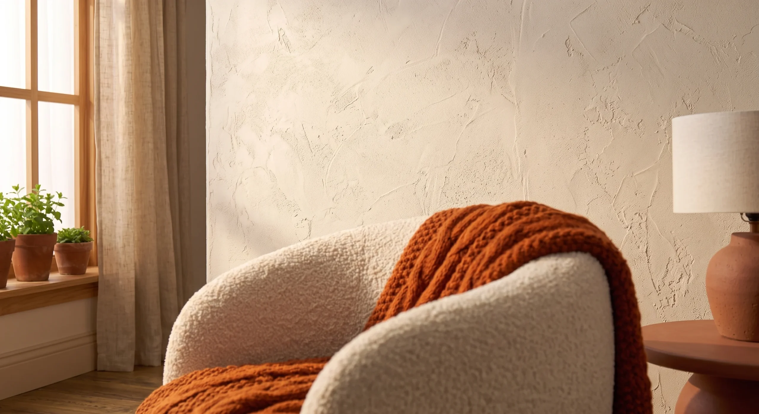
Textured plaster walls bring genuine material depth into a room through the wall surface itself, rather than relying entirely on paint color or furniture to carry the palette’s visual interest. A hand-troweled plaster finish, applied in a warm cream tone, catches and shifts under changing natural light throughout the day in a way that a flat, smooth painted wall simply cannot replicate, adding a genuinely organic, handmade quality to what’s often the largest single surface in any room in the house. The texture also shifts subtly depending on the time of day.
This is a more involved, renovation-level commitment compared to most other ideas on this list, requiring a skilled plasterer rather than a simple weekend paint job, but the resulting texture provides a genuinely lasting architectural foundation for the rest of the palette to build on. As an architect, I find this approach particularly effective in a room meant to feel calm and grounded, since the subtle surface variation adds real richness without ever tipping into visual busyness or distraction anywhere. This approach works especially well in an entryway or a primary bedroom, where a calmer, more grounded material story tends to matter most.
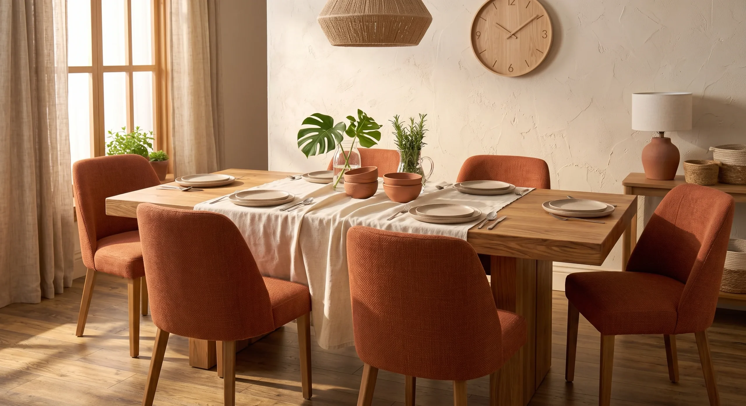
Terracotta Dining Chairs
Terracotta dining chairs bring this palette directly into one of a home’s most functional, frequently used pieces of furniture, rather than confining the color to purely decorative accessories that see far less daily interaction and wear. This works especially well paired with a warm wood dining table, keeping the room’s overall material story cohesive from the chairs down through the table’s own natural grain and tone, rather than introducing an isolated color choice that doesn’t relate to anything else nearby in the room. Mixing in a plain wood chair at the table’s ends keeps the arrangement from feeling too uniform.
Choosing a genuinely durable, easy-to-clean upholstery fabric matters considerably here, given how much daily use and occasional spillage dining chairs actually get compared to a living room accent chair used more occasionally. A performance fabric in terracotta achieves the same visual warmth as a more delicate material, without the practical maintenance concerns that come with a dining room seeing regular meals, guests, and the general wear of everyday family life around the table each week. Investing in this fabric choice upfront genuinely saves money over time, since it avoids the need for reupholstering after just a few years of regular use.
- Terracotta dining chairs bring this palette into a functional, frequently used piece of furniture.
- This works well paired with a warm wood table, keeping the room’s material story cohesive.
- Choosing a durable, easy-to-clean fabric matters here, given how much daily use dining chairs actually get.
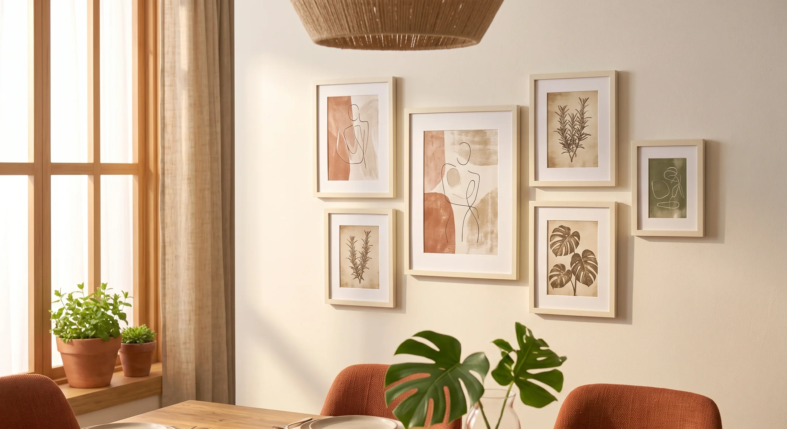
Cream Gallery Frames
- Cream-toned frames, rather than black or dark wood, keep a gallery wall feeling soft and cohesive.
- This works especially well with warm-toned artwork, avoiding a cold contrast between frame and image.
- Matching frame tones across the whole grouping reads as more intentional than mismatched finishes.
- This is a good way to extend the palette onto a wall without a full paint commitment.
Cream-toned picture frames, rather than the more common black or dark wood options, keep a gallery wall feeling genuinely soft and cohesive with the rest of this palette, rather than introducing a harder, higher-contrast element into an otherwise warm and gentle room. This works especially well when paired with warm-toned artwork, like botanical prints or abstract pieces in terracotta and cream tones themselves, avoiding the cold visual contrast that a stark black frame can create against a warmer image nearby. Varying the frame sizes slightly, rather than using identical dimensions throughout, keeps the overall grouping feeling collected rather than mass-produced.
Matching frame tones consistently across an entire gallery grouping reads as considerably more intentional and considered than a mismatched collection of different finishes competing for attention on the same wall. This is a genuinely good way to extend the palette onto a wall without committing to a full accent color, since the frames themselves carry the warmth while the actual wall paint can remain a simple, neutral cream or white underneath the arrangement itself. Leaving a bit of breathing room between each frame also helps the grouping read clearly, rather than feeling cluttered or visually crowded together.
Layered Terracotta Tones
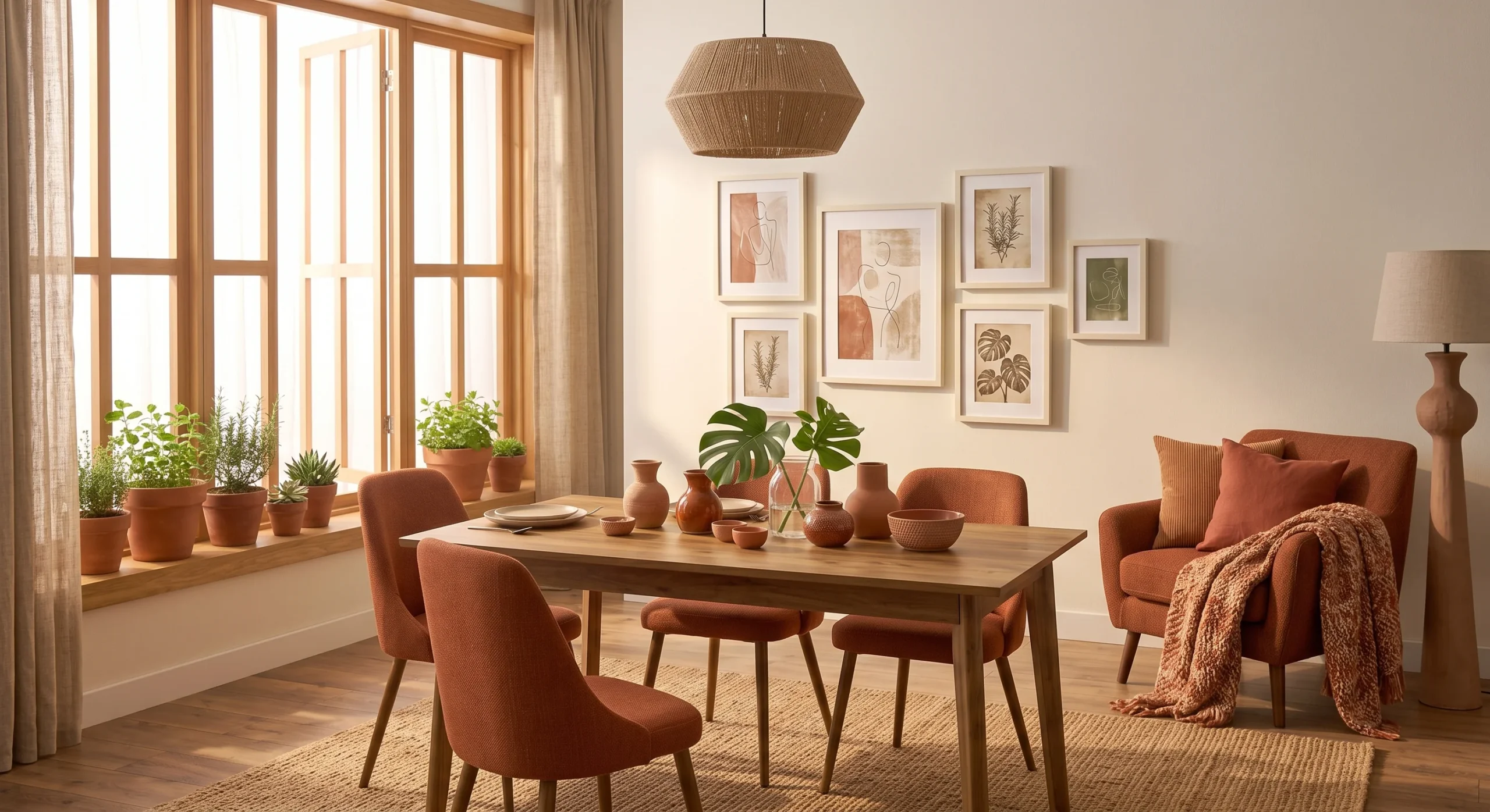
Most people assume a palette needs one single shade to look cohesive, but that’s not true. Layered terracotta tones close out this list by embracing something that might initially seem risky: using several different shades within the terracotta family, rather than a single matched tone, throughout the same room. A deeper rust cushion, a mid-tone terracotta pot, and a lighter clay-colored throw can all coexist within one space, since they share the same warm undertone even while varying in depth and saturation, creating genuine richness rather than a flat, single-note color story.
This works because these tones all originate from the same natural clay-based color family, meaning they relate to each other visually even without being an exact match, the same way different wood tones can coexist in a room without needing to match perfectly. As an architect, I think of this layered approach as the most sophisticated way to use this palette, moving beyond a single terracotta accent toward a genuinely rich, considered material story that develops gradually across an entire home over time and life.
FAQ
Will a terracotta and cream palette feel dated in a few years?
This particular combination draws on genuinely traditional, natural materials, like clay and linen, which tend to age considerably better than trend-driven color choices tied to a specific decade. It’s worth thinking of this less as a passing trend and more as a return to materials that have worked in homes for centuries.
How do I introduce this palette without a full renovation?
Start with accessories — pottery, cushions, a throw — before considering anything permanent like a painted wall or new tile. This lets you genuinely test how the palette feels in your specific lighting before committing to anything harder to change.
Does this palette work in a small space, or does it make rooms feel smaller?
It genuinely works well in a small space, as long as the cream stays dominant and terracotta stays in the minority as an accent rather than the primary color. A small room painted entirely in a deep terracotta can feel cozy, but keeping the balance tipped toward cream generally keeps a small space feeling open.
Should I bring in a professional for a bigger change like tile or plaster?
For anything involving real construction, like a plaster wall finish or a full kitchen backsplash, it’s genuinely worth getting a professional opinion first — you can book a consultation directly at https://wa-associates.com/book-a-consultation/ to talk through what your specific space and budget can support. For accessories and paint, most of these ideas are manageable without one.
Conclusion
A terracotta and cream color palette proves that warmth doesn’t require boldness — every idea on this list brings genuine character into a home through material and tone rather than through anything loud or difficult to live with. Start with the lowest-risk options, a piece of pottery or a throw, before considering anything more permanent like a painted wall or new tile. The goal is a home that feels warm and grounded, not a room chasing a passing trend. Save this list to Pinterest for your next project, try one idea this week, and share it with anyone drawn to warmer, earthier tones.