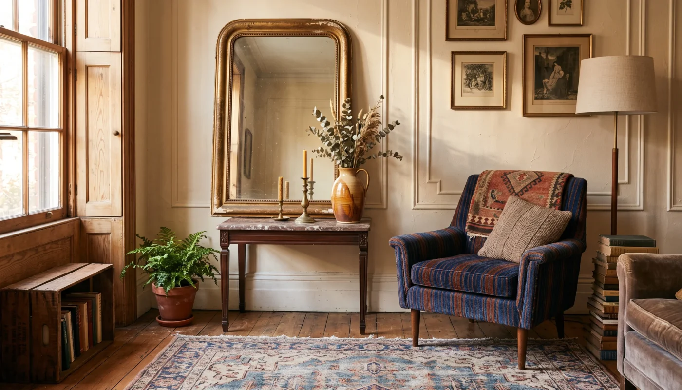

A warm minimalist living room proves that restraint and comfort aren’t opposites — the two can genuinely work together when the right materials and proportions are in play. As an architect, I think of minimalism less as an absence of things and more as an intentional editing process, where every remaining piece earns its place through material, texture, or proportion. This list gathers twenty ideas built around that exact balance for 2026, favoring warmth over the stark, cold minimalism that gives the whole style a bad reputation. By the end, you’ll have a clear framework for a living room that feels both calm and genuinely lived in.
Start Here: Neutral Layered Textiles
This is the single fastest way to add warmth to a minimalist room without adding visual clutter — a few thoughtfully layered textures do more work than any single statement piece, and it requires no structural change at all.
Neutral Layered Textiles
- Layering two or three neutral textures — bouclé, linen, wool — adds real warmth without adding visual clutter.
- Staying within one tonal family keeps the layered look feeling calm rather than busy or mismatched.
- A chunky knit throw draped casually over a sofa arm adds immediate texture with almost no effort.
- This works in any budget range, since texture matters more here than the price of the material.
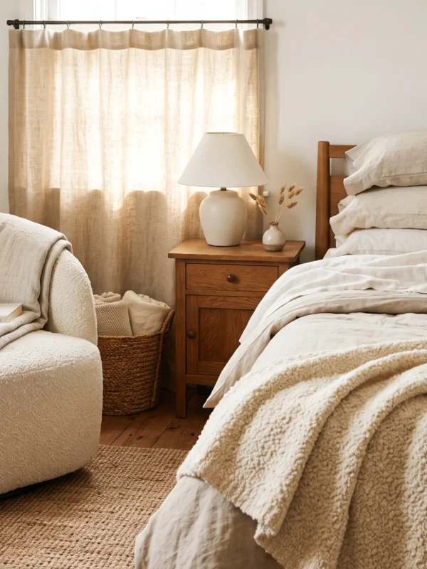
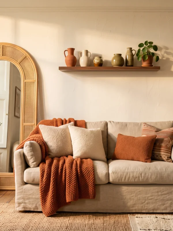
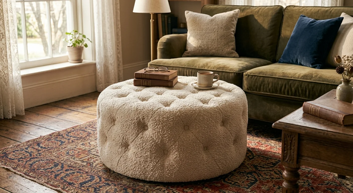
Neutral layered textiles are the single most effective tool for adding genuine warmth to a minimalist room, since texture does the emotional work that color and pattern usually handle in a more maximalist space. A bouclé throw pillow layered against a linen sofa, or a chunky knit blanket draped over a smooth leather arm, introduces tactile variation that keeps a restrained palette from reading as flat or cold. As an architect, I think of this as adding depth to a materials palette without adding a single additional object to the room’s actual footprint.
Staying within one tonal family — a range of warm creams, oatmeals, and soft taupes — keeps this layering feeling genuinely calm and intentional rather than visually busy or mismatched, which is the trap a lot of textile layering falls into when colors compete rather than complement each other. This approach works within nearly any budget, since the real value lives in the contrast between textures rather than in the price of any individual material used. A single well-chosen throw can transform a sofa’s entire presence.
Natural Wood Tones
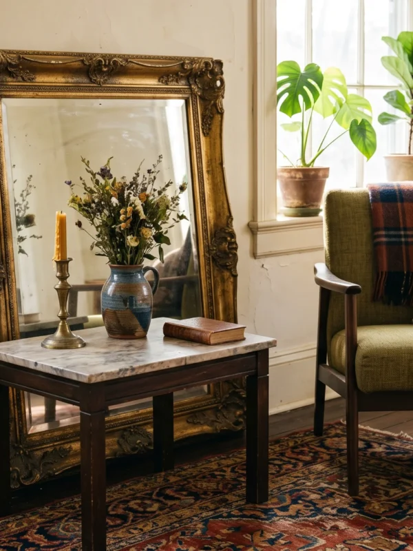
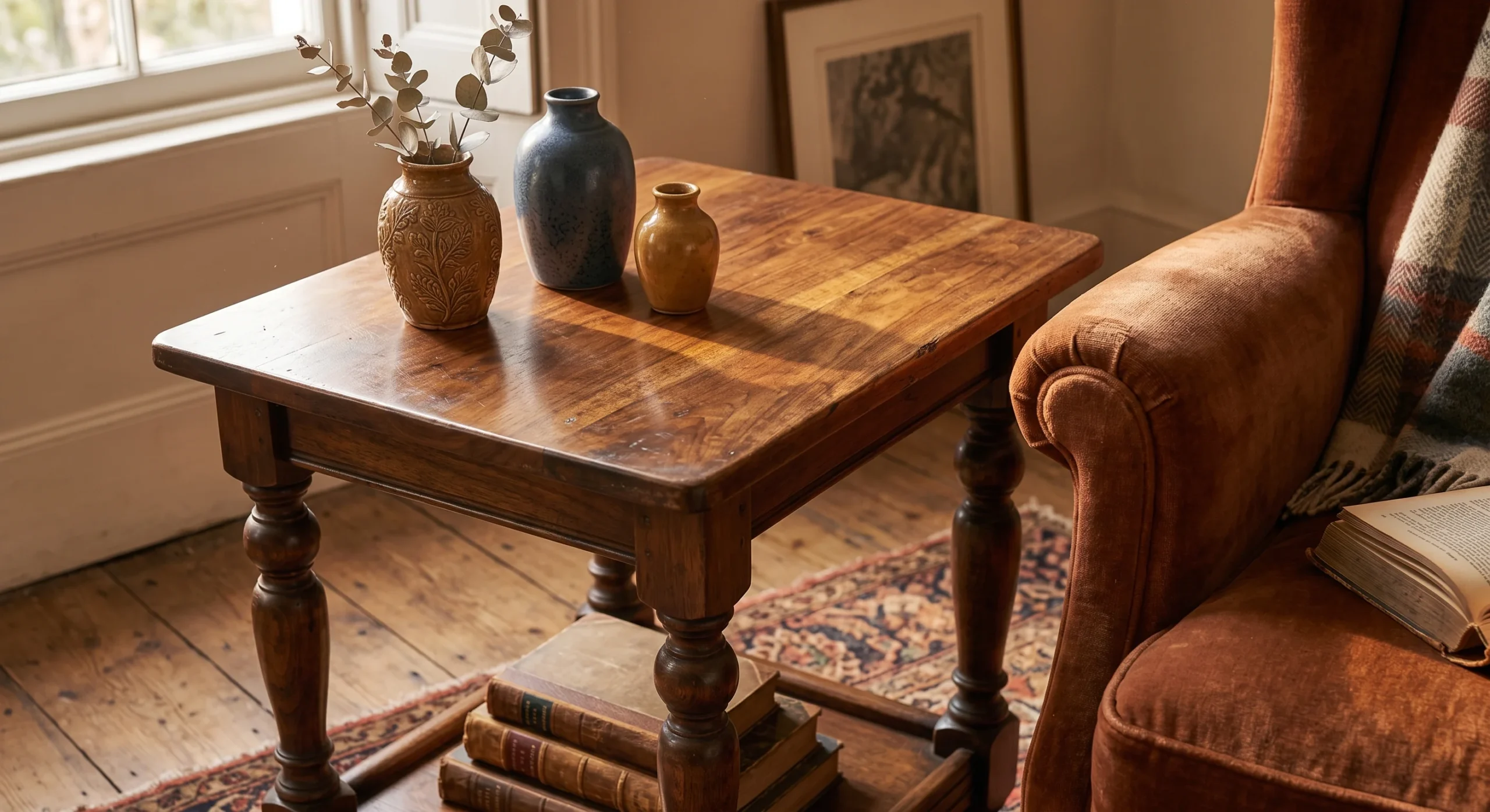
Natural wood tones bring genuine warmth into a minimalist room without requiring any additional color, pattern, or ornamentation to do it, since the wood grain itself provides visual texture and material interest on its own terms. A warm oak or walnut side table, left with its natural grain visible rather than painted or heavily lacquered, grounds a room’s material palette in something genuinely organic rather than purely manufactured, which is exactly the kind of contrast a minimalist room benefits from most, especially against smoother surrounding surfaces.
Mixing two complementary wood tones, rather than matching every wood surface in the room exactly, tends to read as more intentional and genuinely collected over time, avoiding the overly matched showroom look that can make a space feel less personal. This works especially well concentrated on furniture legs, a side table, or one larger case piece like a media console, letting the wood act as a warm anchor against the room’s more neutral, restrained surrounding palette, tying the whole composition together visually from one corner of the room to the next.
- Natural wood grain adds warmth and visual texture without introducing any additional color or pattern.
- Mixing two complementary wood tones, rather than matching everything exactly, reads as more intentional and collected.
- This works especially well on furniture legs, side tables, or a single larger case piece.
Low-Profile Furniture
- Furniture with a lower profile visually opens up the room’s vertical space above it.
- Visible slim legs, rather than a skirted base, let light and sightlines pass underneath the piece.
- This works especially well in a room with lower ceilings, where bulky furniture can feel oppressive.
- A lower silhouette also reinforces the horizontal, grounded feeling central to minimalist design.
Low-profile furniture, particularly a sofa or armchair sitting closer to the ground with a genuinely lower overall silhouette, visually opens up the vertical space above it, making a room feel considerably more spacious than the same square footage filled with taller, bulkier pieces. Visible slim legs, rather than a heavy skirted base that touches the floor, let both light and sightlines pass underneath each piece, reinforcing an overall sense of openness that a minimalist room depends on structurally to feel genuinely uncluttered from every angle.
This approach works especially well in a room with genuinely lower ceiling heights, where bulkier, taller furniture can quickly start to feel oppressive or cramped against the available headroom. A lower silhouette throughout the room also reinforces the horizontal, grounded feeling that’s central to minimalist design more broadly, echoing the same architectural principle that guides low-slung Mid-Century Modern homes. The overall effect is a room that feels calm and spacious rather than visually crowded or heavy, no matter its actual measured square footage on the original architectural plans.
Curved Furniture Silhouettes
Curved furniture silhouettes introduce a genuinely welcome softness into a minimalist room, which otherwise tends to rely heavily on straight lines and sharp, geometric edges throughout its furniture and architectural details. A single rounded armchair or a curved-back sofa breaks up that rigidity without introducing any additional color, pattern, or ornamentation, letting the shape itself carry the visual interest instead. As an architect, I find curves particularly effective in a room with otherwise hard architectural lines, since the contrast between the two genuinely softens the overall composition without compromising the room’s underlying restraint.
This doesn’t mean every piece in the room needs a curved silhouette — one or two rounded pieces against an otherwise straight-lined room reads as considerably more intentional than an entire room of curves competing with each other for attention. A curved accent chair paired with a rectangular sofa, for instance, creates genuine visual dialogue between the two forms rather than either simply repeating the other. This restraint in how many curved pieces actually get used throughout the room is itself a core minimalist principle worth genuinely respecting.
Sculptural Floor Lamp
A sculptural floor lamp does genuine double duty in a minimalist room, functioning as both real task lighting and a standalone art object, which matters considerably in a style that generally avoids purely decorative pieces without functional purpose. A tall arc lamp with a curved metal stem, positioned beside a reading chair or in an empty corner, adds real visual height and interest to the room without requiring an actual piece of wall art or a shelf full of styled objects to fill that same space.
This works especially well in a corner that would otherwise sit visually empty or require additional furniture just to feel genuinely complete, since the lamp’s sculptural silhouette alone carries enough visual weight to anchor that part of the room on its own. Choosing a lamp with a genuinely striking, distinctive silhouette, rather than the most purely functional or generic design available, adds real character to a room that otherwise relies on genuine restraint rather than an abundance of competing decorative objects scattered throughout its every visible surface.
- A single sculptural lamp doubles as both genuine task lighting and a standalone art object.
- This works well in an empty corner that would otherwise need additional furniture to feel complete.
- Choosing one striking silhouette, rather than a purely functional design, adds real visual interest.
Textured Boucle Sofa
- Bouclé fabric adds genuine tactile texture that a smooth linen or leather sofa simply can’t offer.
- This works as the room’s primary textural statement, letting everything else stay genuinely simple around it.
- A neutral bouclé tone keeps the sofa feeling minimal despite its noticeably more tactile surface.
- This is a genuine investment piece, worth prioritizing over several smaller decorative purchases.
A textured bouclé sofa gives a minimalist room its primary tactile statement, offering a looped, nubby surface that a smooth linen or leather sofa simply cannot replicate, no matter how carefully it’s styled around. This single piece can carry the room’s entire textural interest on its own, which is exactly the kind of restraint minimalist design depends on: one genuinely interesting material choice, rather than several competing textures scattered across many smaller pieces throughout the room’s overall composition and material story from wall to wall.
Choosing a neutral bouclé tone, rather than a bold or saturated color, keeps the sofa feeling genuinely minimal despite its noticeably more tactile, textured surface compared to the room’s other, smoother materials. This is worth treating as a genuine investment piece, prioritized over several smaller decorative purchases that would add less lasting impact to the room’s overall feel. A bouclé sofa, chosen well, tends to remain the room’s genuine focal point for years without ever feeling dated or out of place within the space, season after season, year after year.
Warm White Walls
Warm white walls solve one of the most common complaints about minimalist design: that a stark, cool white paint color can make a room feel clinical or genuinely uninviting rather than calm. Choosing a warm white with subtle cream or beige undertones, rather than a paint with blue or gray undertones, keeps the walls feeling soft and genuinely inviting under natural light throughout the day, without sacrificing the clean, restrained backdrop a minimalist room depends on structurally for the rest of its furnishings and decor to read clearly against.
Most people assume any white paint reads the same in a room, but the undertone genuinely changes how a space feels throughout the day, shifting subtly as natural light moves across the walls from morning through evening. A warm white also photographs and lives considerably better alongside the natural materials — wood, linen, bouclé — that already define this style, avoiding the visual clash that can happen when a cool-toned wall meets an otherwise warm-toned room full of organic materials throughout its palette and overall furnishing choices.
Woven Jute Rug
A woven jute rug brings genuine ground-level texture into a minimalist room, its visible natural weave adding real material interest to the floor without introducing any additional color or pattern that might compete with the room’s more restrained palette elsewhere. This matters structurally as much as visually, since a rug of some kind genuinely anchors furniture that might otherwise feel like it’s floating on a bare floor, unmoored from any clear sense of where the room’s actual seating area genuinely begins and ends within the layout.
Jute’s natural, warm tone works well with nearly any surrounding color palette, making it one of the more genuinely flexible starting points for building out a room’s overall material story from the floor up. This is often one of the first purchases worth making in a minimalist living room specifically, since the rug establishes both a defined zone and a textural foundation that every other material choice in the room can then genuinely build on top of successfully over time, one considered purchase at a time.
- A jute rug’s natural, visible weave adds ground-level texture without introducing color or pattern.
- This grounds the room’s furniture visually, anchoring pieces that might otherwise feel like they’re floating.
- Jute’s natural tone works with nearly any color palette, making it a genuinely flexible starting point.
Statement Ceramic Vase
- A single oversized vase serves as sculptural decor without needing anything else placed around it.
- Choosing an organic, irregular shape over a perfectly symmetrical one adds genuine visual character.
- This works well left completely empty, or filled simply with a few dried branches.
- One well-chosen vase does more visual work than several smaller decorative objects combined.
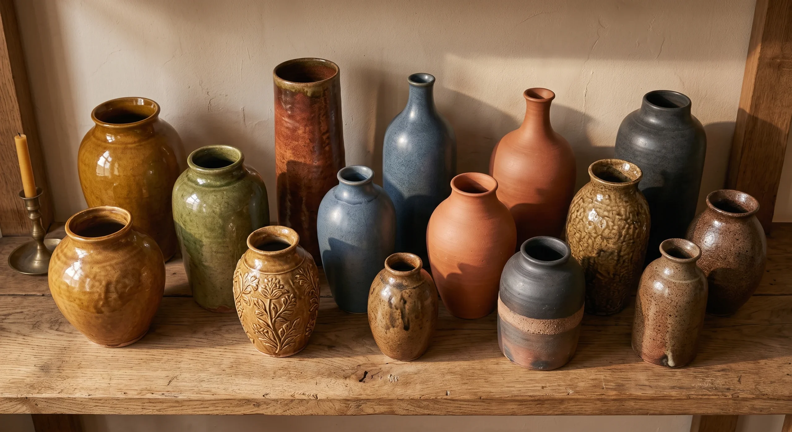
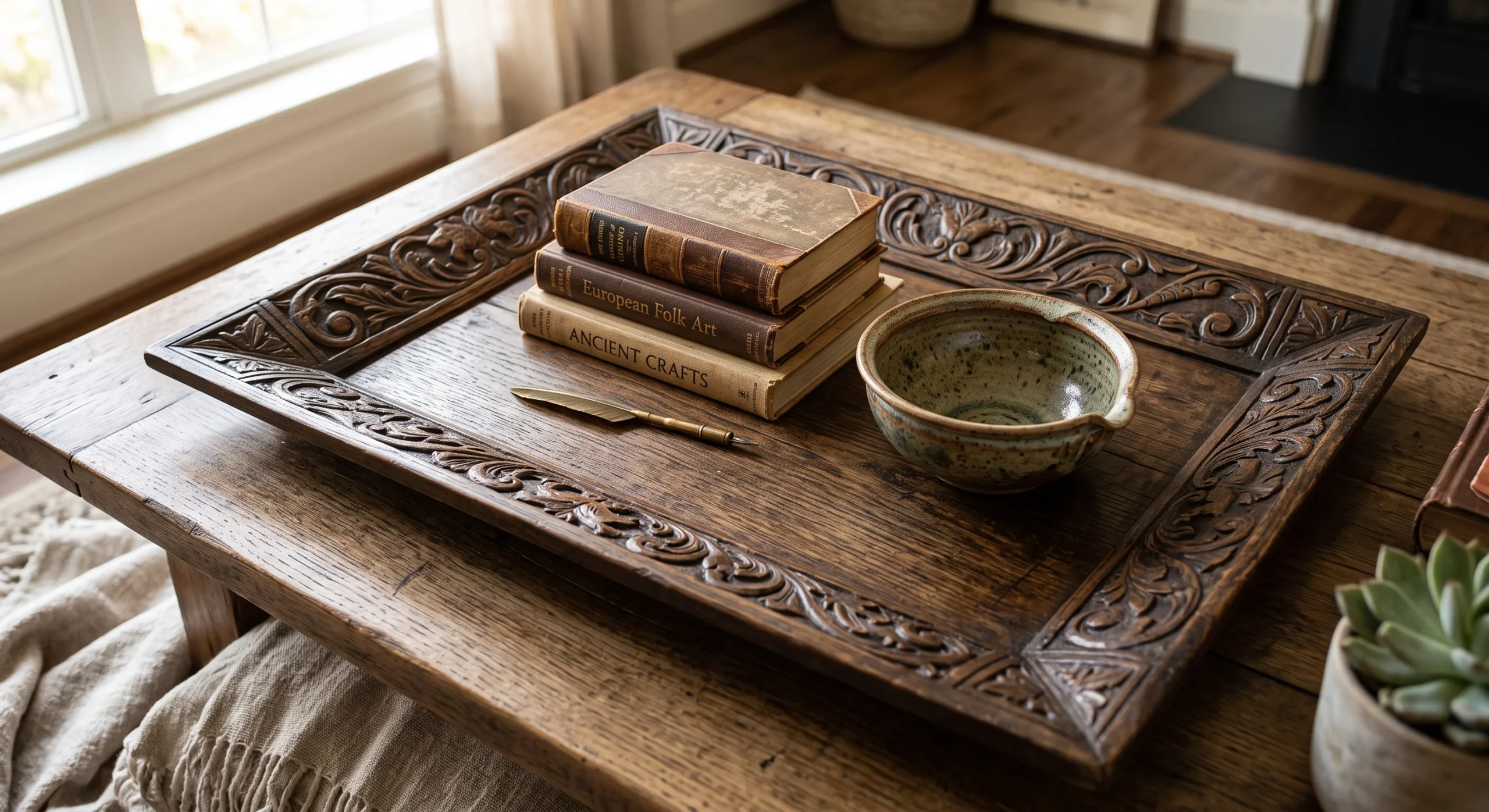
A statement ceramic vase, sized generously and placed alone on a console table or the floor beside a sofa, functions as genuine sculptural decor without requiring any additional objects arranged around it to feel visually complete. This single-object approach is central to minimalist styling: rather than grouping several smaller decorative pieces together, one larger, well-chosen object carries the same visual weight on its own, with considerably less visual clutter competing for attention across the same surface or nearby shelf area throughout the whole room, from one end of the sofa to the other.
Choosing an organic, slightly irregular shape over a perfectly symmetrical, mass-produced form adds genuine visual character and a sense of handmade quality to the piece, even when the room around it stays otherwise quite restrained and simple. This works well left completely empty, letting the vase’s form speak entirely for itself, or filled simply with a few dried branches or a single stem for a bit of additional organic texture without overcomplicating the overall composition or material story already established elsewhere throughout the room’s material palette.

Minimal Gallery Wall
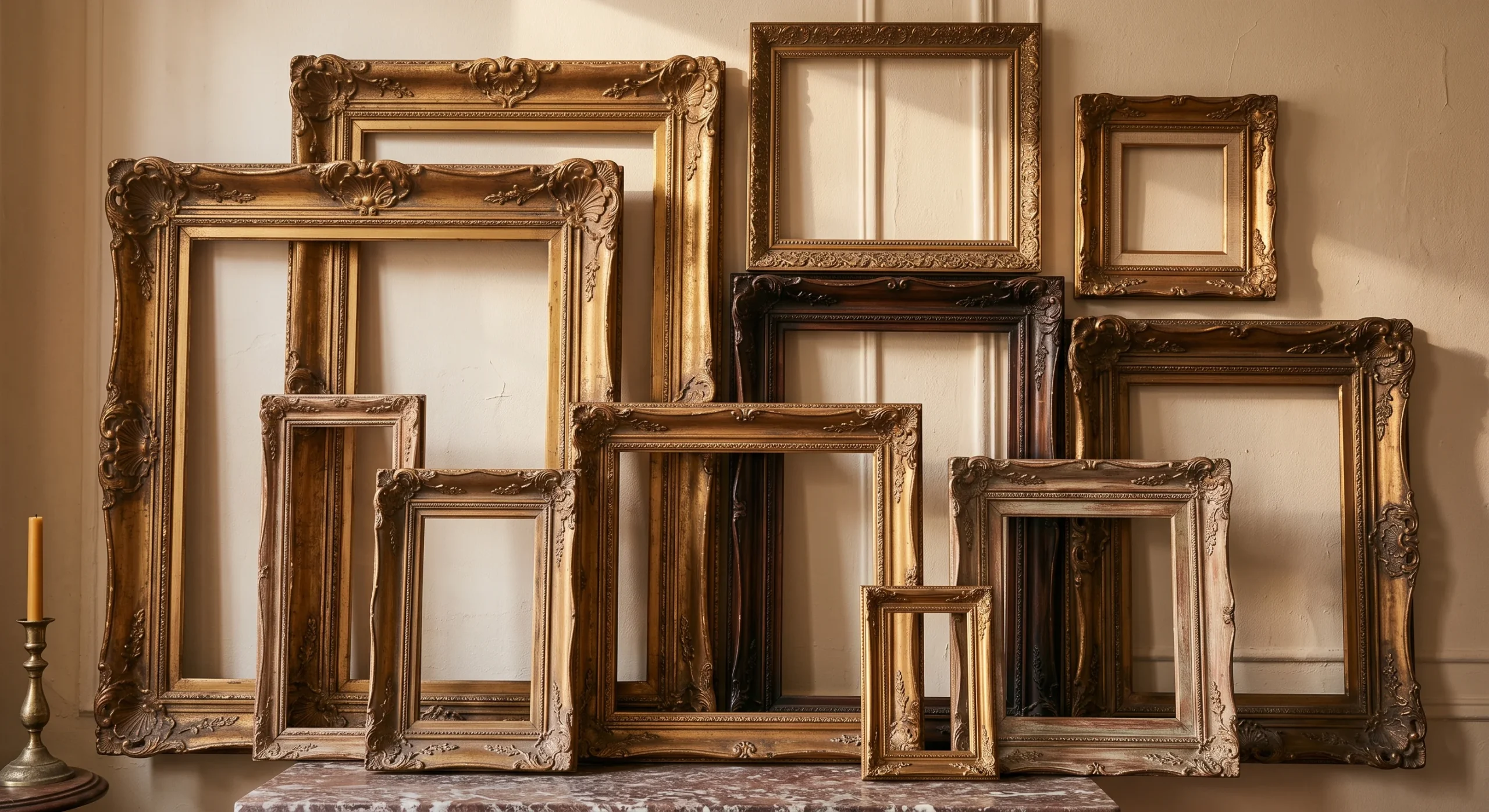
A minimal gallery wall reduces the traditional dense, floor-to-ceiling gallery arrangement down to just two or three carefully chosen pieces, spaced generously apart from each other rather than clustered tightly together. This generous spacing is what actually reads as intentional and considered, giving each individual piece genuine room to be seen and appreciated on its own, rather than competing visually with a dozen neighboring frames for the same limited wall space and genuine viewer attention throughout the room’s overall composition, wall after wall, across the entire space.
Matching frame styles and finishes across all the pieces keeps the overall arrangement feeling cohesive and genuinely calm, rather than an eclectic mix that can read as busier than a true minimalist room typically wants to feel. This works especially well paired with artwork that shares a limited, related color palette, rather than several bold, high-contrast pieces competing for attention across the same wall. The result is a wall that feels genuinely curated rather than simply filled with whatever art happened to be available at the time.
- Generous spacing between just two or three frames reads as intentional rather than a crowded traditional gallery wall.
- Matching frame styles and colors keep the arrangement feeling cohesive and genuinely calm.
- This works well with a limited color palette across the artwork itself, rather than varied bold pieces.
Linen Drapery Panels
- Floor-to-ceiling linen panels visually elongate a room, making ceilings feel taller than they actually are.
- Linen’s natural texture and slight wrinkle add organic softness without introducing any pattern.
- Neutral linen panels diffuse harsh daylight into something softer throughout the room.
- Hanging curtains close to the ceiling, rather than just above the window frame, reinforces height.
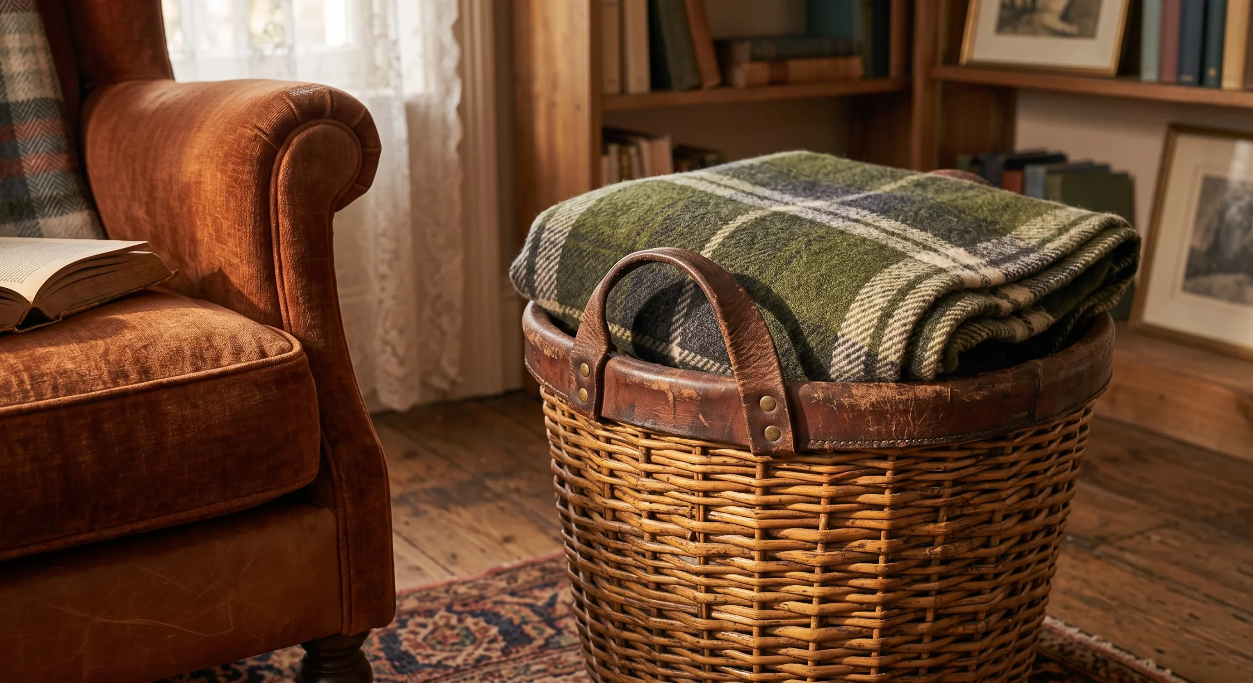
Linen drapery panels, hung from floor to ceiling rather than stopping just above the window frame, visually elongate a room’s proportions, making the ceiling read as considerably taller than its actual measured height. This is a genuine architectural trick worth using deliberately: mounting the curtain rod close to the ceiling line, rather than directly above the window itself, draws the eye upward and reinforces a sense of real vertical space throughout the entire room, regardless of the room’s true measured dimensions on the original architectural drawings.
Linen’s natural texture and characteristic slight wrinkle add genuine organic softness to a room without introducing any actual pattern, keeping the material interest subtle rather than visually loud or distracting. Neutral linen panels also diffuse harsh, direct daylight into something considerably softer and more even throughout the room, which matters for both comfort and the overall warm, calm mood a minimalist living room is generally trying to establish through its material choices throughout the day, as light shifts from a soft morning glow to a warmer evening tone.
Stone Coffee Table
- A stone coffee table adds genuine material weight and permanence to an otherwise soft, textile-heavy room.
- Natural veining in the stone provides visual interest without requiring any additional pattern or color.
- A rounded stone shape softens the material’s inherent heaviness, keeping the room feeling calm rather than stark.
- This works as a genuine focal point, needing minimal additional styling on top of it.
- Stone’s cool, solid surface offers a deliberate material contrast against the room’s warmer textiles.
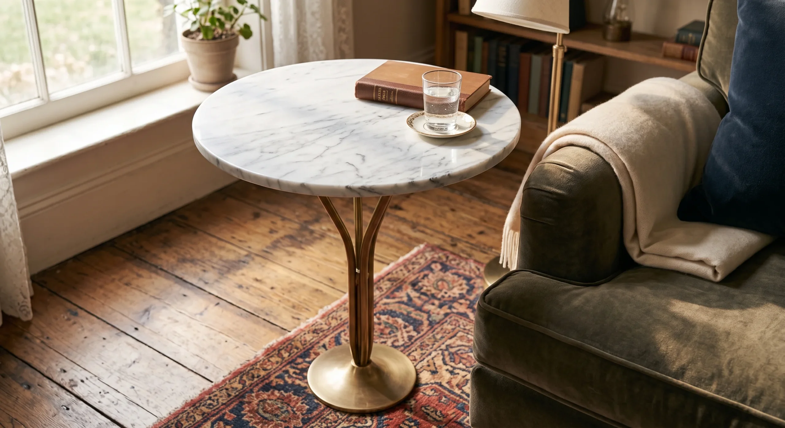
A stone coffee table introduces genuine material weight and a sense of permanence into a room that otherwise leans heavily on soft textiles and warm wood tones throughout its overall material palette. Natural veining running through the stone’s surface provides real visual interest entirely on its own terms, without requiring any additional pattern, color, or decorative styling layered on top of it to feel genuinely complete or visually resolved within the room’s broader composition and overall material story, from the floor up to the walls.
Choosing a rounded rather than sharply angular stone shape softens the material’s inherent visual heaviness, keeping the overall room feeling calm and approachable rather than stark or unapproachably formal in its central seating area. This piece works well as a genuine focal point requiring minimal additional styling layered on top of its surface, since the stone’s natural texture and form already provide plenty of visual interest. Its cool, solid surface also offers a deliberate, grounding material contrast against the room’s warmer surrounding textiles and softer furnishings nearby.
Hidden Storage Solutions
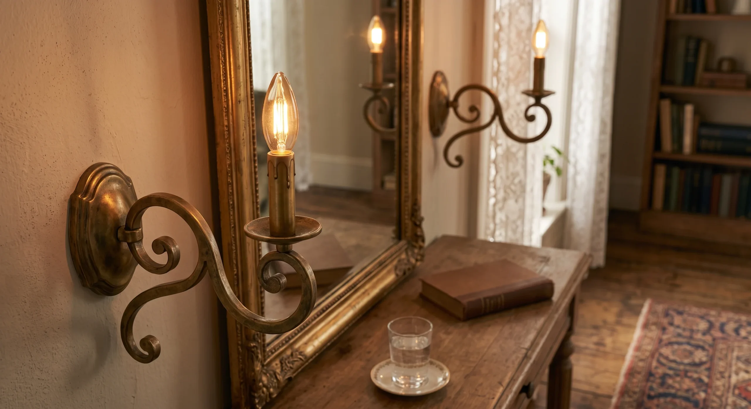
Hidden storage solutions matter more in a minimalist living room than in almost any other design style, since visible clutter directly undermines the calm, restrained feeling the entire room is actively working to create through its careful material and furniture choices. A closed console or media unit, rather than open shelving, keeps everyday items like remotes, chargers, and mail out of sight, letting the room’s visible surfaces stay genuinely clear and intentional rather than gradually accumulating daily clutter over the course of an ordinary week.
This lets the room’s carefully chosen visible surfaces stay genuinely restrained and uncluttered without actually sacrificing the real, practical storage every household genuinely needs somewhere to keep its everyday items. A storage ottoman doubling as both seating and a hidden compartment works especially well for smaller items, combining function and minimalist form in a single piece rather than requiring a separate, dedicated storage solution elsewhere in the room’s overall layout and floor plan entirely. This kind of dual-purpose furniture is genuinely worth prioritizing throughout the rest of the room too.
- Closed storage keeps everyday clutter out of sight, which matters more in a minimalist room than any other style.
- This lets the room’s visible surfaces stay genuinely restrained without sacrificing real practical storage.
- A storage ottoman or closed console works well for remotes, chargers, and other small daily items.
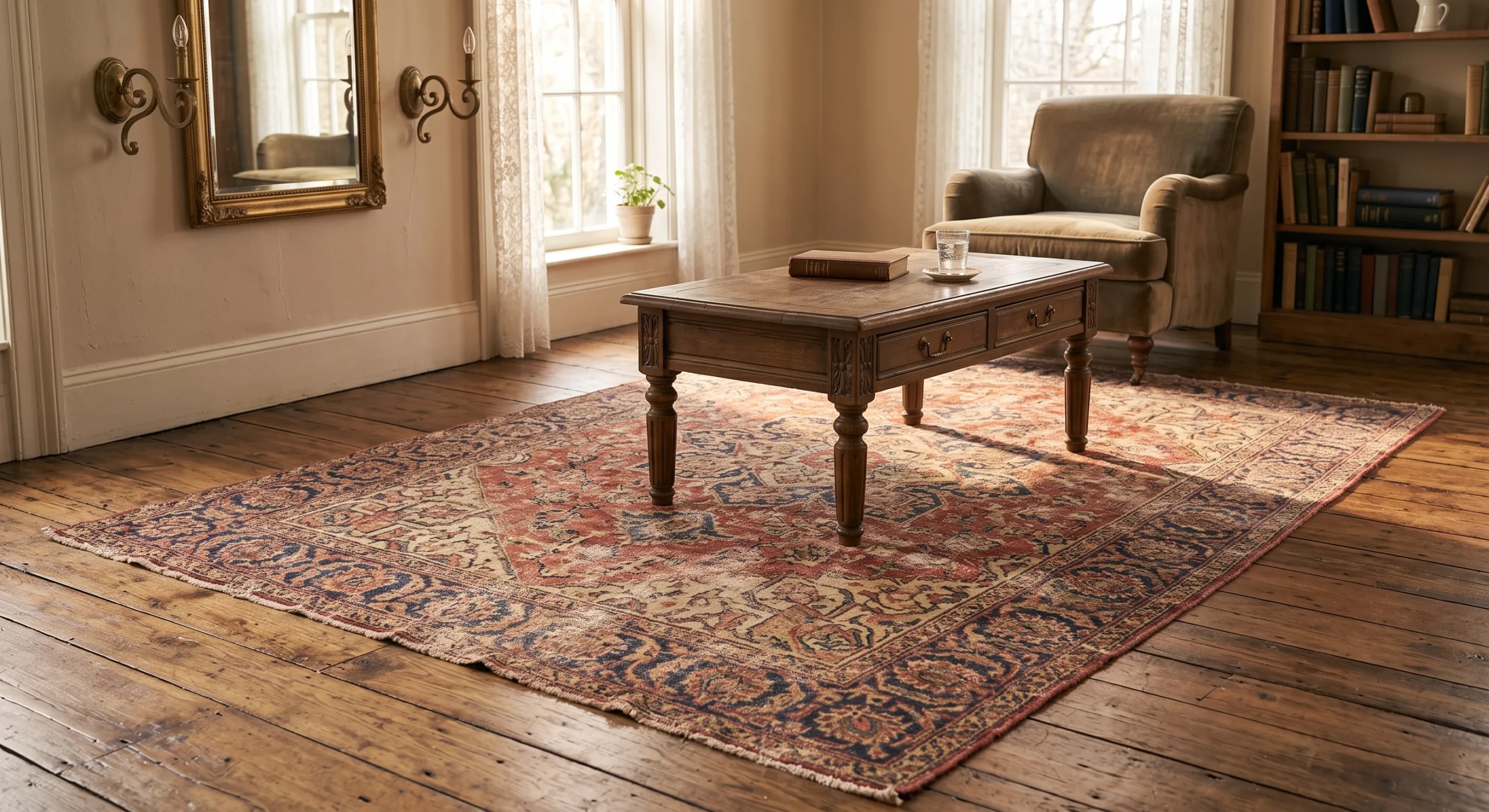
Single Accent Chair
A single accent chair, in a warm tone that stands slightly apart from the room’s otherwise neutral palette, gives a minimalist living room one genuine moment of color or contrast without tipping the whole space into visual busyness. This is a deliberate exception to an otherwise restrained palette, and it works precisely because it’s the only exception being made — introducing a second or third colorful piece elsewhere in the room would dilute the impact this single chair is specifically designed to carry on its own.
Positioning the chair somewhere it naturally draws the eye, near a window or angled slightly toward the room’s main seating area, lets it function as a genuine focal point rather than simply another piece of seating blending into the background. As an architect, I think of this the same way a single accent wall works in an otherwise neutral room: the surrounding restraint is exactly what makes the one deliberate exception feel genuinely intentional rather than random or unplanned within the room, rather than just another piece competing for the same visual space.
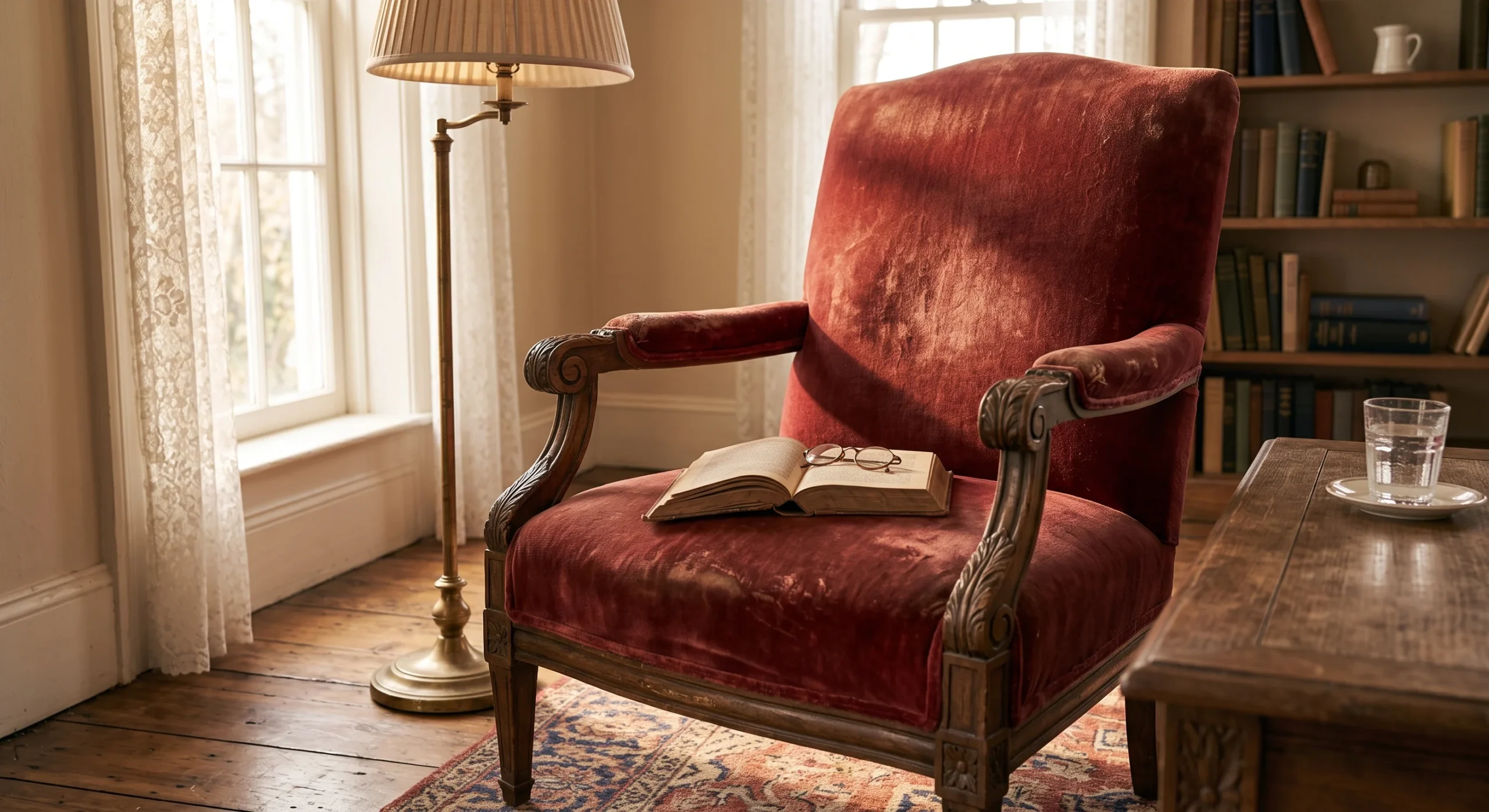
Warm Metal Accents
- Warm metals like brass or bronze add subtle shine without the coldness of chrome or stainless steel.
- This works well on lamp bases, drawer pulls, or a single decorative object placed deliberately.
- A little warm metal goes a long way — overusing it can tip the room toward glam rather than minimal.
- Matching metal finishes throughout the room keeps the accents feeling cohesive rather than scattered.
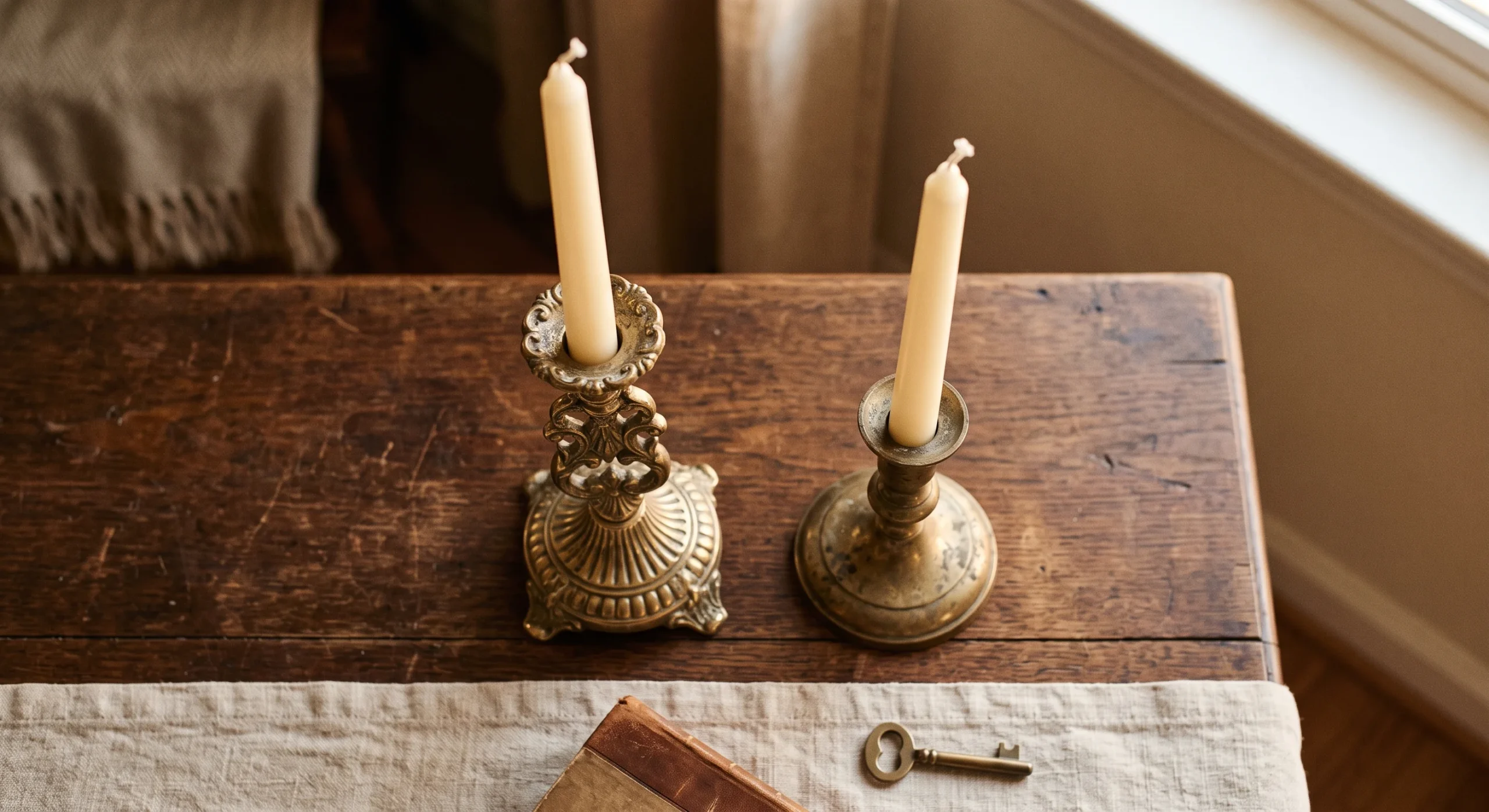
Warm metal accents, particularly brushed brass or aged bronze rather than cool-toned chrome or stainless steel, introduce a subtle shine and material contrast into a room otherwise dominated by matte textiles, natural wood, and soft neutral tones throughout its overall palette. This small amount of reflective material catches and redistributes ambient light throughout the room in a way that purely matte surfaces simply cannot replicate, adding genuine visual interest without requiring any additional color or pattern to accomplish that exact same effect elsewhere in the room.
This works especially well concentrated on smaller details — a lamp base, cabinet drawer pulls, a single decorative tray or bowl placed deliberately on a console — rather than large furniture pieces, where too much metal can tip the room’s overall feeling toward glam rather than genuinely minimal. Matching metal finishes consistently throughout the room keeps these accents feeling cohesive and intentional rather than scattered and mismatched, reinforcing the same careful material discipline that defines the rest of the room’s overall design and furnishing choices.
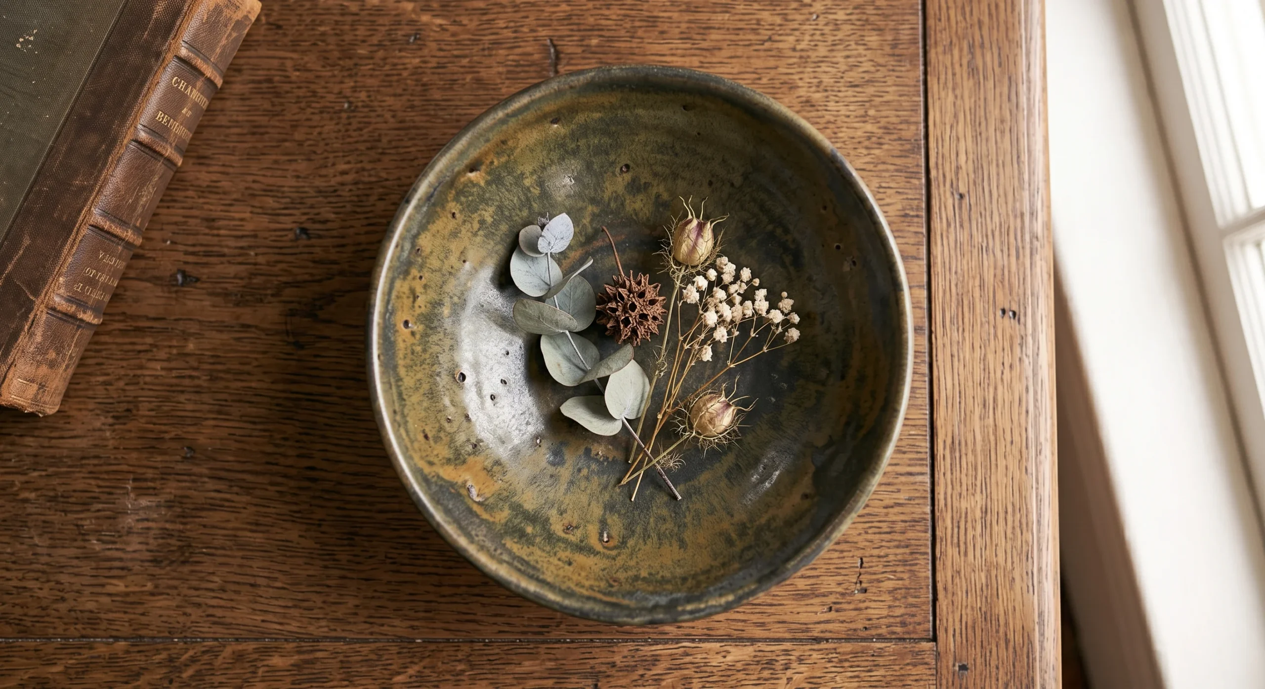
Negative Space Styling
Negative space styling treats empty space itself as a genuine design element, rather than a gap that needs to be filled with additional objects, furniture, or decor to feel visually complete and finished. A shelf holding just one or two carefully chosen objects, with real, deliberate breathing room left around them, reads as considerably more intentional and confident than the same shelf crowded with a dozen smaller items competing for the same limited visual attention across its entire length and depth, competing for the exact same limited visual space.
Most people assume a minimalist room simply has fewer things in it, but the deeper principle is that the empty space between objects carries just as much visual weight as the objects themselves, framing and elevating whatever’s actually present in the room. As an architect, I think of this the same way negative space works in a floor plan — the unbuilt space shapes how the built space actually gets experienced and understood by anyone moving through it, just as much as the walls themselves do.
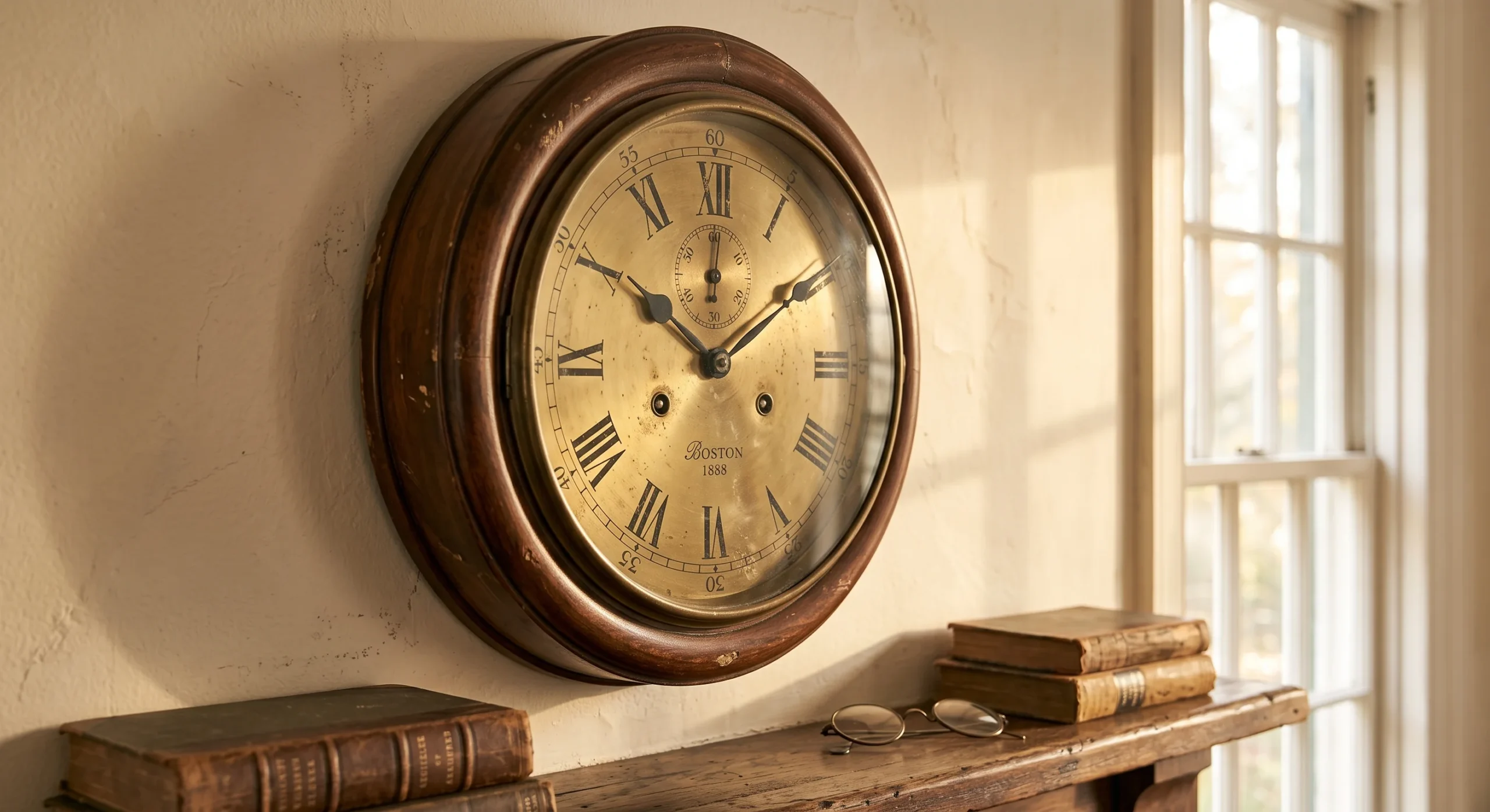
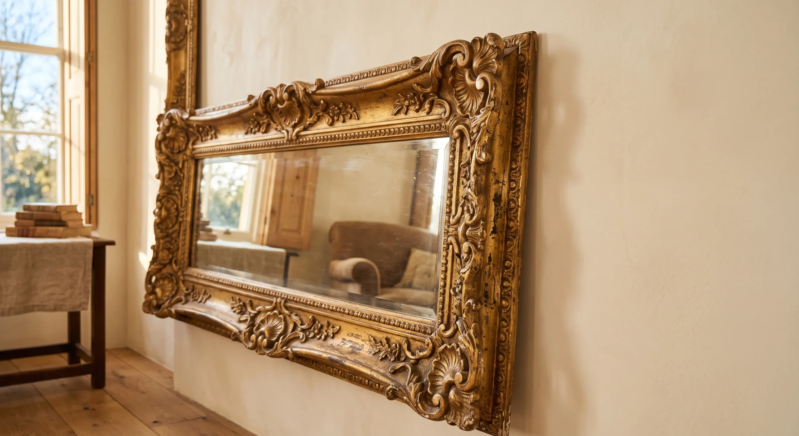
Organic Shaped Mirror
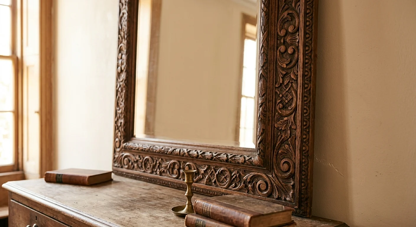
An organically shaped mirror, with an irregular, asymmetrical silhouette rather than a standard rectangular or circular frame, adds genuine visual softness and interest to a wall that might otherwise stay entirely bare in a minimalist room. This single piece does real functional work too, since mirrors genuinely bounce natural light deeper into a room, brightening the overall space measurably beyond what the window alone would achieve without that additional reflective surface working alongside it throughout the day, from early morning through the last hours of evening light.
This works especially well as a single, deliberate statement piece positioned above a console table or a mantel, where its unusual shape naturally draws the eye without requiring any additional artwork or decor nearby to feel genuinely complete. Choosing a frame material that echoes something else already present in the room, like a warm wood tone or a matching metal finish, ties the piece back into the room’s broader material story rather than letting it feel like an isolated, disconnected addition to the wall, unconnected to anything else the room is already saying.
- An irregularly shaped mirror adds visual interest and softness compared to a standard rectangular frame.
- Mirrors also genuinely bounce natural light deeper into a room, brightening the overall space.
- This works especially well as a single statement piece above a console or mantel.
Layered Ambient Lighting
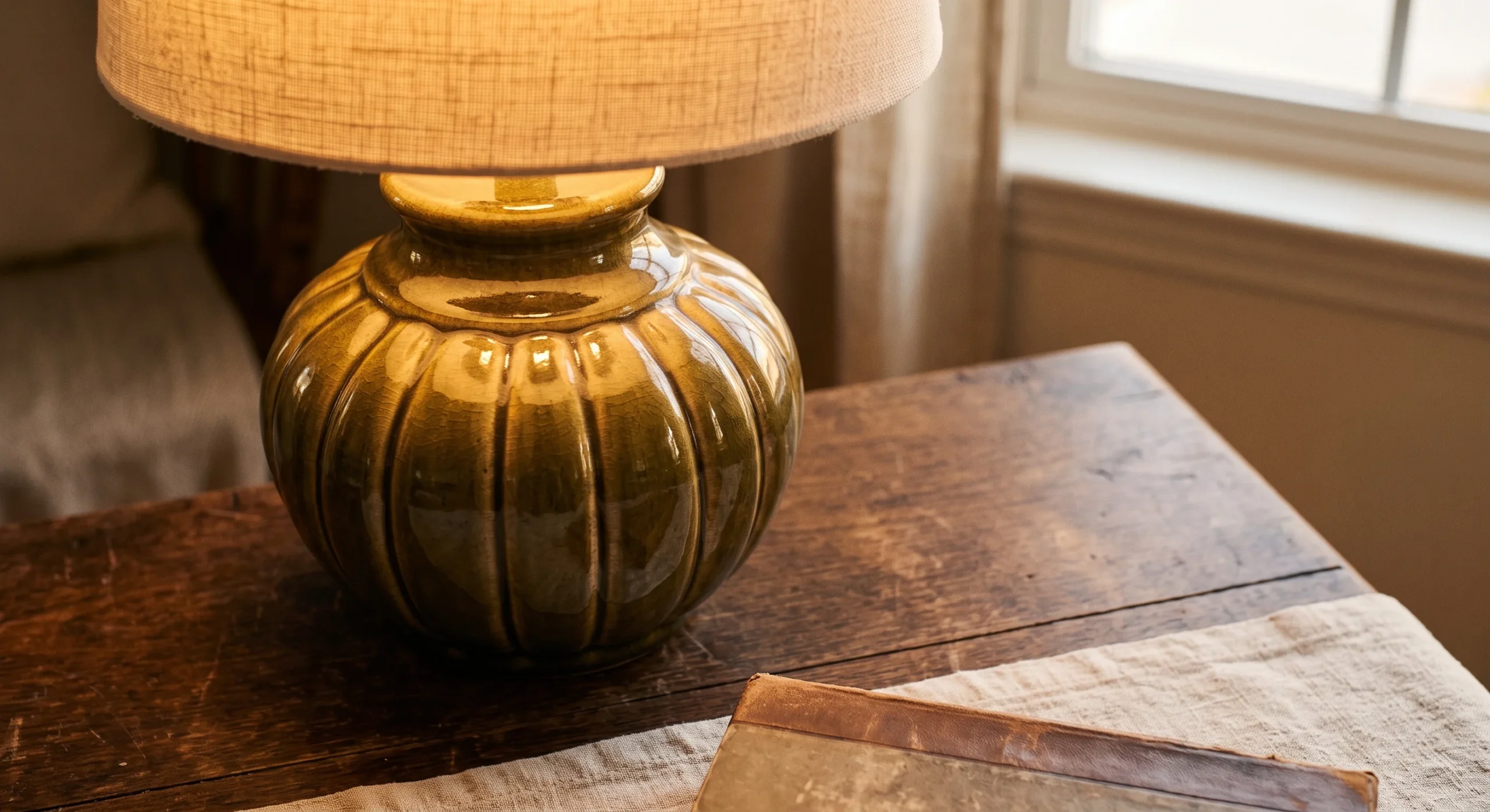
Layered ambient lighting combines several softer, warmer light sources throughout a room, rather than relying on a single harsh overhead fixture to illuminate the entire space evenly and flatly. A floor lamp, a table lamp, and perhaps a wall sconce, each providing a pool of warm light at a different height and location, create genuine depth and visual interest across the room that a single central light source simply cannot replicate on its own, no matter how bright that single fixture happens to actually be on its own.
This matters considerably for a minimalist room specifically, since flat, even overhead lighting tends to make a restrained, simple space feel cold or clinical rather than genuinely calm and inviting the way warm, layered lighting does instead. Choosing warm-temperature bulbs throughout, rather than cool or neutral white light, reinforces the same overall warmth this entire list is built around achieving. In the evening, this layered approach transforms the same room into something considerably more atmospheric and comfortable to actually spend real time in, evening after evening, year round.
Muted Earth Palette
- A muted palette of terracotta, sage, and sand tones adds subtle color without disrupting the room’s calm feel.
- Keeping every color within the same muted saturation level prevents any single hue from competing for attention.
- This works well introduced through small accessories rather than large furniture pieces or wall color.
- Earth tones connect a minimalist room back to natural materials already present, like wood and stone.
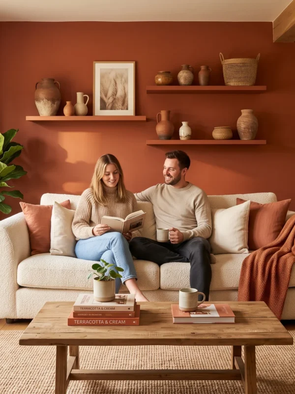
A muted earth palette — soft terracotta, dusty sage, warm sand — introduces subtle, genuine color into a minimalist room without disrupting the overall calm, restrained feeling the rest of the space is working to establish throughout its material and furniture choices. Keeping every color within roughly the same muted saturation level prevents any single hue from visually competing for attention against the others, letting the whole palette read as cohesive and genuinely intentional rather than scattered or randomly assembled piece by piece over time.
This approach works especially well introduced gradually through smaller accessories — a throw pillow, a ceramic bowl, a single piece of art — rather than committed to permanently through large furniture pieces or a bold wall color that would be considerably harder to change later. Earth tones also connect a minimalist room back visually to the natural materials, like wood and stone, already present throughout the space, reinforcing one cohesive material and color story across the entire room’s overall design and furnishing choices, tying every surface back together.

Single Statement Plant
A single statement plant, chosen for real height and an interesting natural form like a fiddle leaf fig or a tall snake plant, closes out this list because it introduces something no other material on it genuinely can: living, growing organic life into an otherwise carefully controlled, static room. One well-placed plant does considerably more visual work than several smaller plants scattered across different surfaces throughout the room, keeping the overall composition feeling genuinely intentional rather than cluttered with competing greenery scattered throughout the room.
A simple, unpatterned ceramic planter keeps the visual focus squarely on the plant’s own natural form and texture, rather than letting a decorative or patterned pot compete with everything else already happening in the room’s careful material palette. This is a genuinely fitting way to close out a warm minimalist living room, since living greenery is the one material in the entire space that a room genuinely can’t fake or substitute with something manufactured, no matter how well everything else in the room is styled around it.
- One large plant adds genuine organic life to a room without requiring several smaller plants scattered around.
- A simple, unpatterned planter keeps the focus on the plant’s natural form rather than the container.
- This closes out the list well, since living greenery is the one material a room truly can’t fake.
FAQ
How do I keep a minimalist room from feeling cold or sterile?
Warmth comes from material choices more than from adding more objects — natural wood, bouclé, linen, and warm lighting all do far more than a colder palette of glass, chrome, and stark white ever could. Texture is genuinely the key ingredient most cold-feeling minimalist rooms are actually missing.
Is warm minimalism budget-friendly, or does it require expensive materials?
It can genuinely work at almost any budget, since the style depends more on restraint and thoughtful editing than on expensive individual pieces. A few well-chosen items, like a textured throw and a natural rug, do more than a room full of mid-range furniture competing for attention.
How many decorative objects is too many in a minimalist room?
A useful general rule is grouping in odd numbers of one to three per surface, with genuine breathing room between each piece. If a shelf or table starts to feel crowded, it usually is — removing an item almost always improves the composition rather than adding another.
Should I hire a professional to help plan a room like this?
For a full room, it’s genuinely worth considering, especially if you’re also weighing structural changes like layered lighting or built-in storage alongside the styling — you can book a consultation directly at https://wa-associates.com/book-a-consultation/ to talk through your specific space and layout options. For styling alone, most of these ideas are manageable without one.
Conclusion
A warm minimalist living room proves that restraint doesn’t have to mean sacrifice — every idea on this list adds genuine comfort and character through material and texture rather than through more stuff filling the room. Start with the easiest wins, layered textiles and warm lighting, before moving toward bigger investments like a stone coffee table or a statement sofa. The goal was never an empty room, just an intentional one, where everything present genuinely earns its place. Save this list to Pinterest for your next refresh, try one idea this weekend, and share it with anyone drawn to a calmer, warmer version of minimalism.